Color is how we remember who we were before we stopped wearing it.
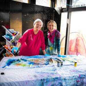
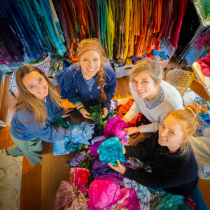
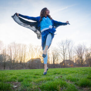
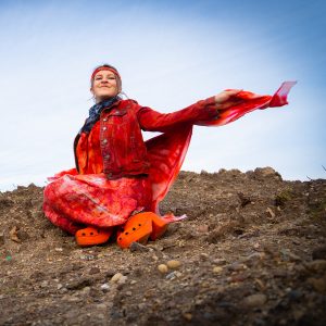
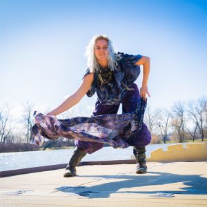
More ∞ Joy transforms garments — and the humans wearing them — through dash-dyeing, somatic portraiture, and the practice of making imperfect, healing art.
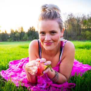
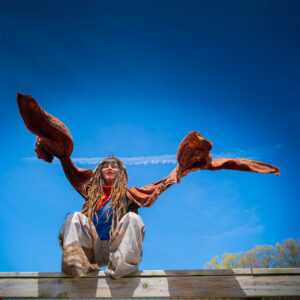
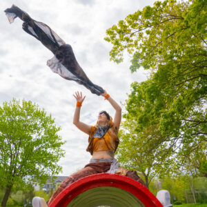
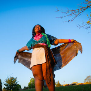
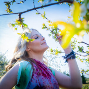
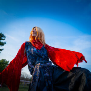
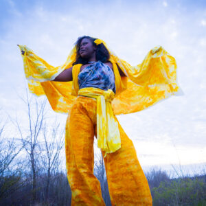
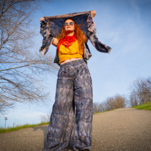
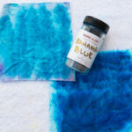
You dress in colors that make you feel alive. We photograph what your body does when it feels free. Somatic, joyful, yours. I can’t wait to witness your joy blossom.
8 questions · no wrong answers · your result is a starting point, not a label
1 of 8
Question 1 of 8
In natural light, how would you describe your skin?
Go with your first instinct — there are no wrong answers.
Question 2 of 8
Look at the inside of your wrist. What color are your veins?
Check in natural daylight — this is one of the most reliable undertone signals.
Question 3 of 8
Which metal feels most like you — near your face, not just in your jewelry box?
Imagine wearing each one. Which makes your skin come alive?
Question 4 of 8
How does your skin respond to sun?
Think about your natural pattern — not what sunscreen changes.
Question 5 of 8
Which row of colors makes your face look most alive?
If you can, hold something near your face in natural light. Go with your gut.
Question 6 of 8
How do neutrals look on you?
Neutrals reveal undertone clearly — they don't distract from your face.
Question 7 of 8
What's your natural hair color — or the color it was before it changed?
If you've colored it for years, go with what felt most natural when you did.
Question 8 of 8
When a color stops you in your tracks — what word best describes how it hits you?
Instinct, not logic. What color stopped you last?
Sessions In Joy
Book Color Time
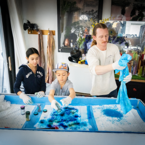
Whether you want to dye something, be photographed in your colors, or finally figure out what your palette actually is — there’s a session for where you are.
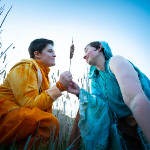
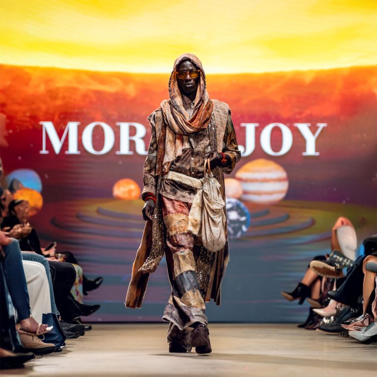
Our projects are not just collections — they are collaborations. Each series invites real people to explore color, movement, identity, and transformation through clothing and portraiture. From Power Portraits to immersive installations and fashion collections, every project begins with a simple question: Who do you become when you wear color that tells the truth about you? Explore past features, current collaborations, and upcoming open calls below.
Michigan Birds is a collaborative portrait project where individuals choose their favorite Michigan bird and are styled in garments inspired by its color and character.
Men In Motion
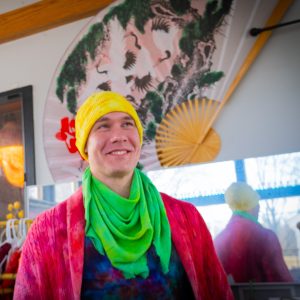
Men in Motion is a portrait series featuring men styled in dash-dyed garments and photographed in movement — in places where they come alive. This project celebrates masculine expression, individuality, and embodied identity through color and motion.
Spectrum Colors
The Spectrum Between Us was an immersive color installation for ArtPrize 2025 — inviting viewers to walk through suspended portraits and experience identity, healing, and joy through color and connection.
Every color has four qualities that define it. Learning these four words will give you a vocabulary for every color decision you make going forward. Learn the language of color through psychology, history, and tools to find the hues that belong to you.
Hue is the color family — red, orange, yellow, green, blue, violet, magenta. It’s the most obvious quality, the one we name first. But two reds can look completely different from each other, and that’s where the other three dimensions come in.
Every color leans either toward warmth (toward orange and yellow) or toward coolness (toward blue and violet). A warm red feels like fire or brick. A cool red feels like a berry or a blue-red wine. Same hue family, completely different presence and effect on your skin.
Value describes how light or dark a color is. Pale pink and deep burgundy are the same hue at opposite ends of the value scale. Light colors feel airy and fresh. Deep colors feel grounded and weighty. Value affects how much visual presence a color has.
Chroma describes the saturation or clarity of a color. A soft (muted) color has grey mixed in — it feels earthy, wearable, subtle. A vivid (clear) color is pure and saturated — it pops, demands attention, and feels bold. Soft chroma colors feel grounded. Clear chroma colors feel gem-like.
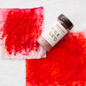
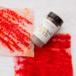
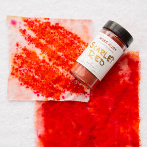
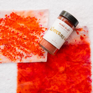
Red increases heart rate. It demands attention before a single word is spoken. Evolutionarily the first color the eye learned to prioritize, red activates the body's alert system — which reads as energy, courage, or urgency depending on context. Two reds can feel completely different: a warm Scarlet charges forward, while a cool Cardinal Red carries formal authority. Temperature changes everything.
Reach for it when
You need motivation to move — red is the color of action
You want to be seen and remembered in a room
You're stepping into a moment that calls for courage
Orange is the most social color. It carries red's energy but softens it with yellow's warmth — the result invites rather than commands. Orange says: come closer. Let's talk. It's associated with play, warmth, and accessibility. Peach and Orange Sorbet feel fresh and approachable; Orange Crush and Pagoda Red bring bold, celebratory heat.
Reach for it when
You want to feel open and approachable in a group setting
You're in a creative or playful space
You want to connect and invite conversation
Let it rest when
You want to fade into the background — orange won't let you
Yellow stimulates the mind faster than any other color — the visual cortex processes it first. It's the frequency of sunlight and the color babies respond to earliest. Daffodil and Clear Yellow feel fresh and springlike; Golden Yellow and Marigold carry the warmth of harvest; Lemon Yellow and Citrus Yellow bring a cool, crisp edge. The wrong yellow on the wrong undertone can feel harsh — the right one is radiant.
Reach for it when
You're starting something new and need optimism
You need to think clearly — yellow activates the mind
You want to signal warmth and approachability
Let it rest when
You're already anxious or scattered — yellow can amplify nervous energy
Green is the most restful color for the human eye — it sits at the exact center of the visible spectrum and requires no adjustment to process. It's the color of living things, of growth, of safety. Yellow-greens like Lime Pop and Chartreuse feel energizing and new; deep greens like Forest Green and New Emerald Green feel grounded and strong; muted olives like Avocado and Moss Green feel earthy and complex.
Reach for it when
You need to restore and regulate your nervous system
You're in a healing or transitional period
You want to feel grounded without withdrawing
Let it rest when
You need high energy and impact — green recedes rather than commands
✦ Spring: Warm aqua — Turquoise, Aqua Marine, Cayman Isle Green
Cyan lives between blue and green — carrying blue's calming clarity and green's fresh vitality. It's the color of shallow tropical water, of light after a storm, of possibility. Turquoise and Aqua Marine feel alive and warm; Teal Blue and Kingfisher Blue carry cool depth; Seafoam, Celadon, and Sea Glass are the most restful — barely-there and serene.
Reach for it when
You need clarity without stimulation — deep thinking, writing, creating
You want to feel open and spacious
You're transitioning between intense states and need a bridge
Let it rest when
You need warmth and human connection — cyan is expansive rather than intimate
Blue is the world's most universally liked color. It slows the heart rate, lowers blood pressure, and creates an atmosphere of trustworthiness — which is why it dominates healthcare, finance, and institutions. Baby Blue and Periwinkle are soft and approachable; Cobalt Blue and Royal Blue carry authority and precision; Navy Blue and Midnight Blue are the most grounding, almost-neutral blues.
Reach for it when
You need to project calm, trustworthiness, and reliability
You're facilitating something that needs to feel safe for others
You need to slow yourself down internally
Let it rest when
You need to feel energized or motivated — blue calms rather than activates
✦ Spring: Clear & warm — Wisteria, Lavender, Sweet Pea
Violet sits at the edge of the visible spectrum — just before ultraviolet, the light we can't see. It holds both blue's calm and red's energy. Associated with imagination, spirituality, and inner authority. Wisteria and Lavender are the softest entry points; Grape and Hydrangea are vivid and bold; Nightshade, Ultra Violet, and Imperial Purple carry the deepest power.
Reach for it when
You're in a creative or intuitive space and want to honor that
You want inner authority that doesn't need to be loud
You're stepping outside convention intentionally
Let it rest when
You want to be taken in a purely straightforward professional direction
Magenta does not exist in the visible light spectrum — there is no wavelength that corresponds to it. When your brain encounters red and violet without a middle wavelength to bridge them, it invents magenta. It's consistently linked to joy, love, and pleasure. Bubble Gum and Sweet Pea are the softest entry points; Hot Pink and Dragon Fruit are bold and electric; Raspberry and Fuchsia Red carry deep, jewel-toned richness.
Reach for it when
You want to signal warmth, openness, and emotional availability
You're celebrating something or want to access levity
You want to boost your mood — magenta is one of the most reliable dopamine colors
Let it rest when
You need to be perceived as purely authoritative or understated
Brown is the color of soil, wood, leather, and skin — the colors of home and belonging. Neutrals are not emotionally neutral: earth tones signal safety and create the feeling of being held. Ivory and Chamois are the lightest; Camel and Golden Brown carry warm radiance; Chocolate Brown, Dark Brown, and Dutch Chocolate ground with depth. Shiitake Mushroom and Truffle Brown add complexity with cool undertones.
Reach for it when
You need to feel rooted and stable
You want to create comfort and warmth in a group setting
You want depth without the intensity of dark colors
Let it rest when
You need high energy or want to project forward visibility
Gray is not the absence of color — it's the presence of all of them, muted. The right gray carries extraordinary sophistication; the wrong one disappears. Cool grays like Blue Gray and Mist Gray feel airy and clean; warm grays like Pewter and Charcoal Gray have just enough depth to feel substantial; deep grays — Timber Wolf, Thunder Cloud, Gunmetal Gray — anchor a palette the way black does, with more nuance.
Reach for it when
You want to let other elements of your look carry the color story
You need sophisticated neutrality that reads as intentional, not invisible
You're building a palette anchor that works with everything
Let it rest when
You need energy, warmth, or forward visibility — gray steps back
Traditional kintsugi repairs broken pottery with gold, honoring the break as part of the story. Chromatic Kintsugi does the same — with color and cloth.
We fill the places where life has split us open with pigment instead of shame. Because the seams deserve to be seen, not hidden.