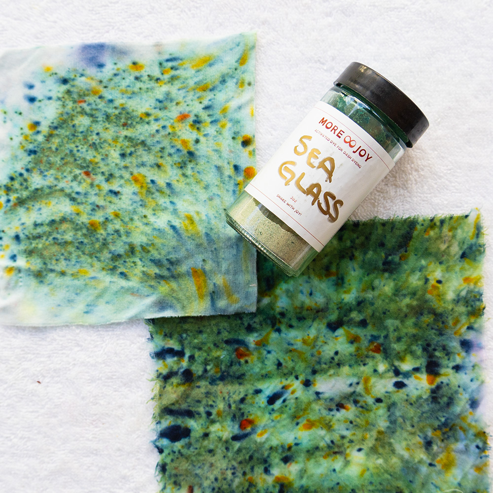
Blue is not just blue. It can be airy like a morning sky, muted like sea glass, deep like midnight or electric like a kingfisher’s back. Same hue, completely different feeling. What changes is how much light, gray or shadow is mixed in.
Painters have names for those four states: hue, tint, tone and shade. They are also the foundation of how I teach seasonal color at More Joy Studio. Once you can see them, you will never look at a rack of clothes the same way again.
The four states of a color
- Hue: the pure color, nothing added. Clear, saturated and bright.
- Tint: the hue plus white. Lighter, softer and more delicate.
- Tone: the hue plus gray. Muted, complex and earthy.
- Shade: the hue plus black. Deeper, richer and more dramatic.
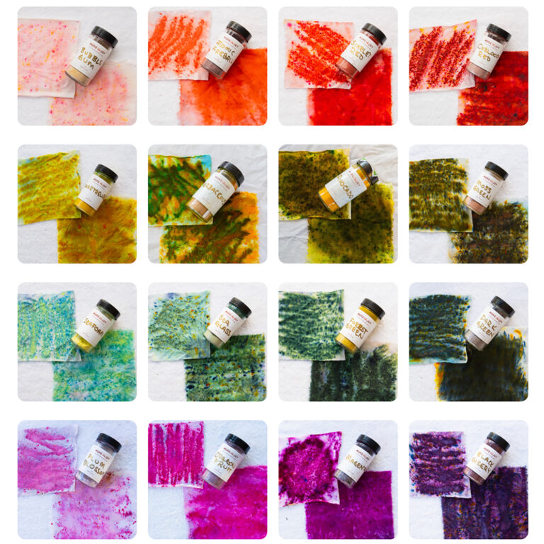
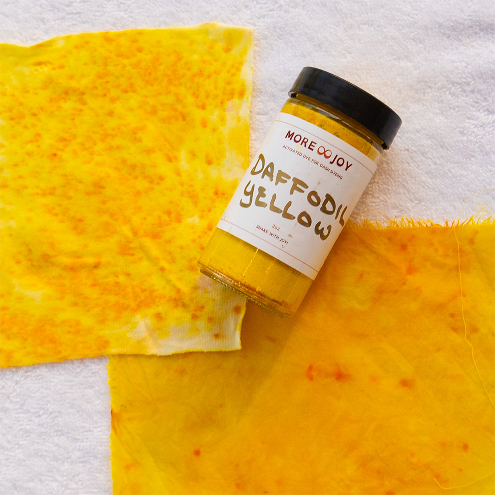
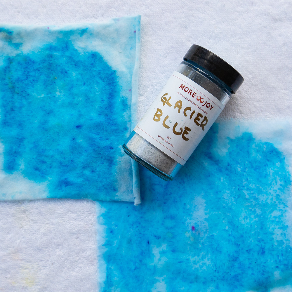
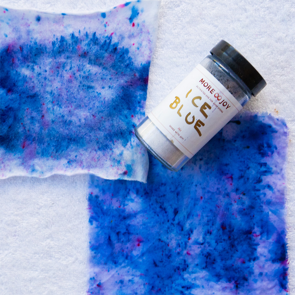
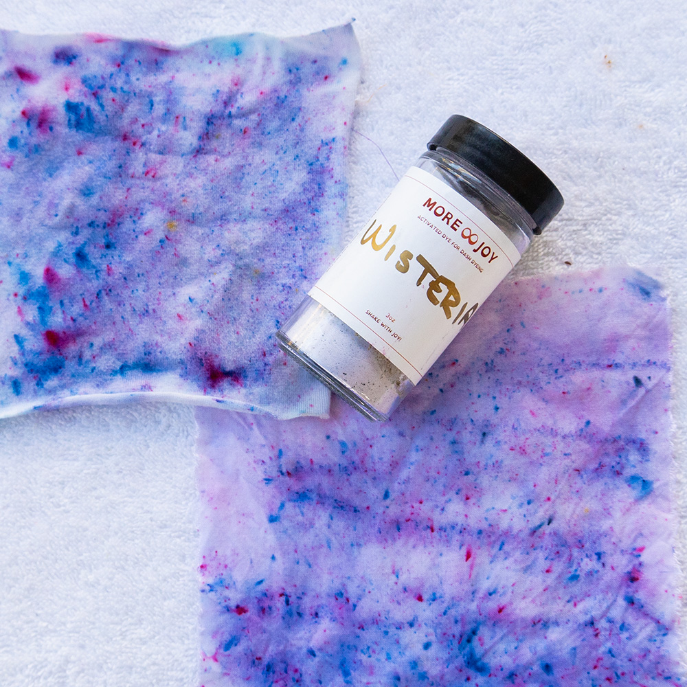
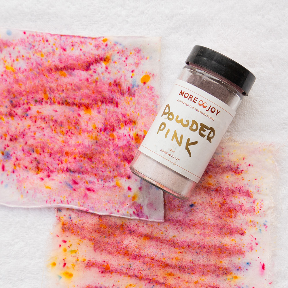
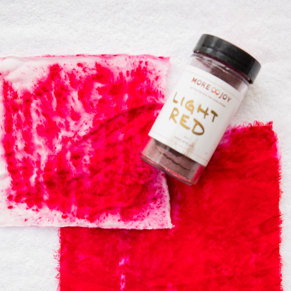
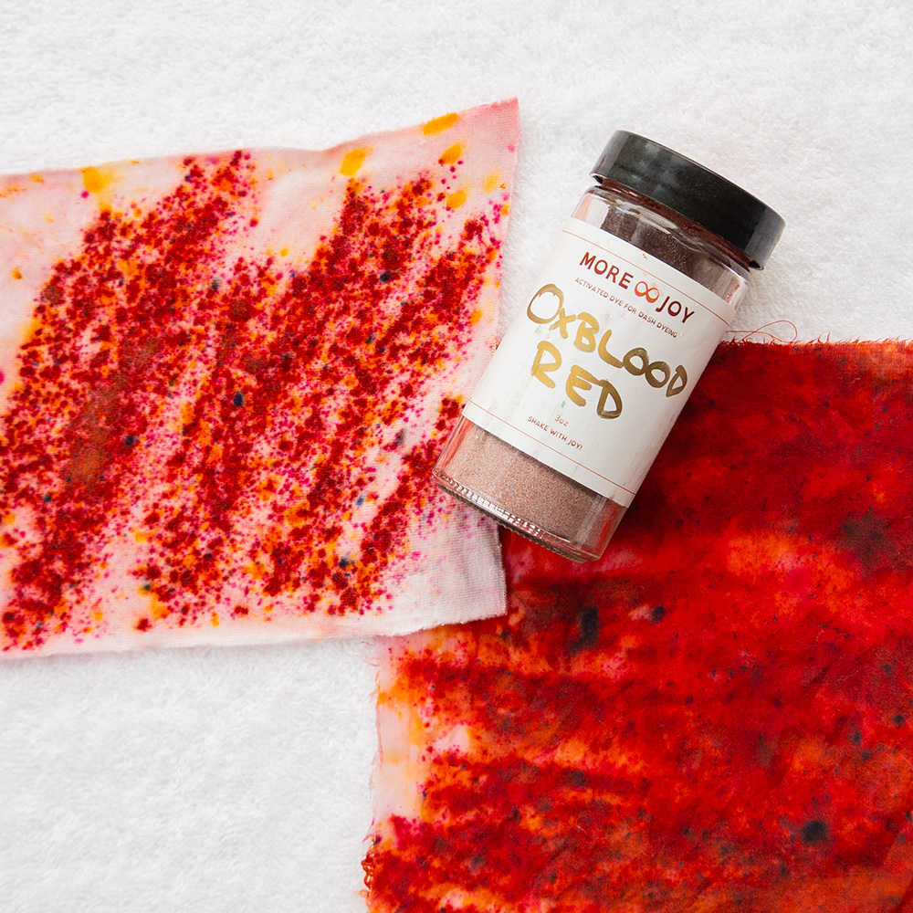
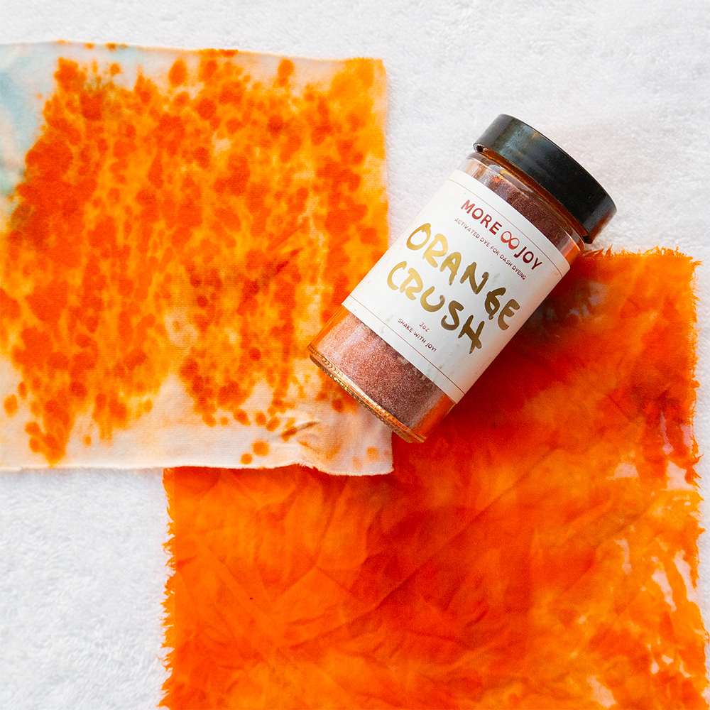
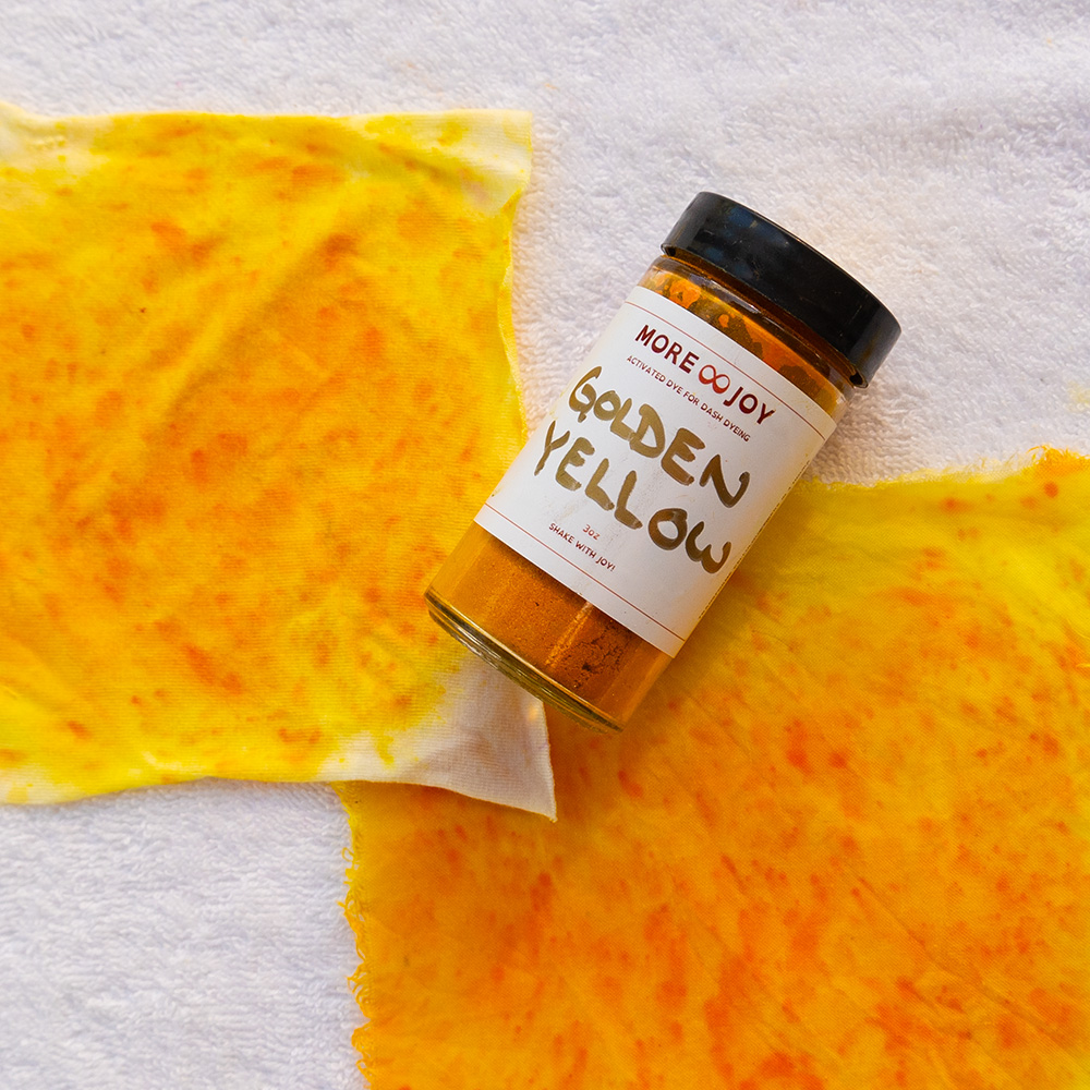
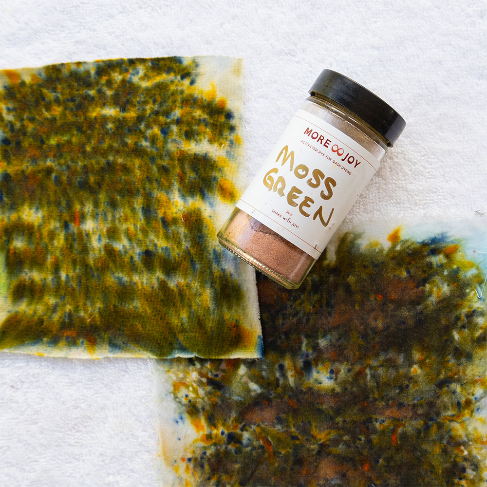
Every one of my 150 dyes sits somewhere on that map. Daffodil is a hue. Powder Pink is a tint. Moss Green is a tone. Midnight Blue is a shade.
How each one feels
Color theory becomes useful when you connect it to the body. In my experience, these four states land very differently:
- Hues feel awake. Hope, beginnings, energy that wants to move.
- Tints feel gentle. Lightness, openness and ease.
- Tones feel thoughtful. Reflection, nuance and the comfort of something lived-in.
- Shades feel powerful. Depth, focus and introspection.
None of these is better than another. They are different moods, and you will need different ones in different seasons of your life.
The four seasons, through color theory
Seasonal color analysis sorts people into four families based on how their natural coloring behaves. Each season lines up with one of the four states, which is why I named them the way I did.
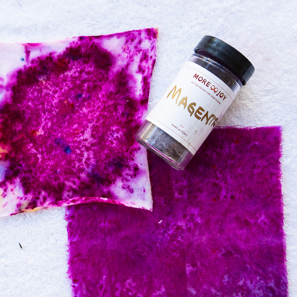
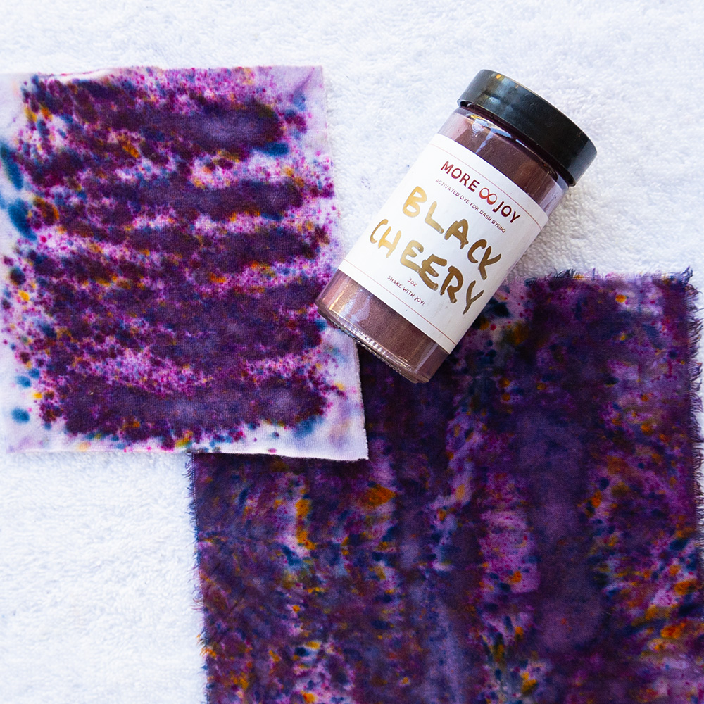
Spring · Hues (bright and fresh)
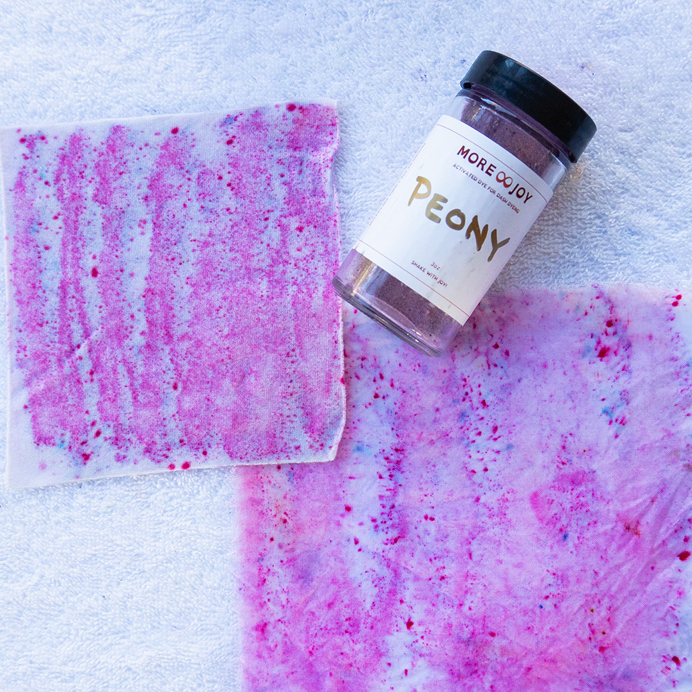
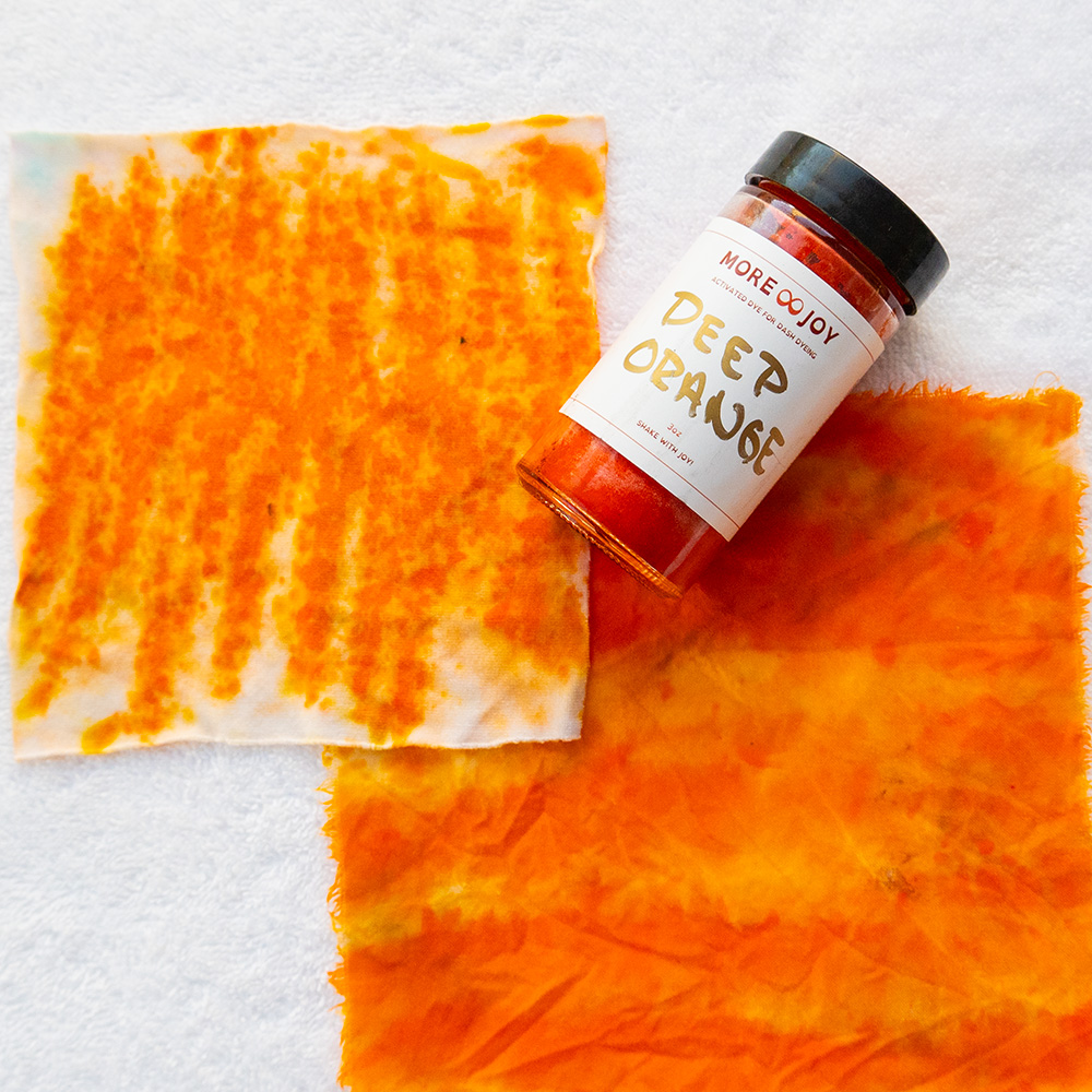
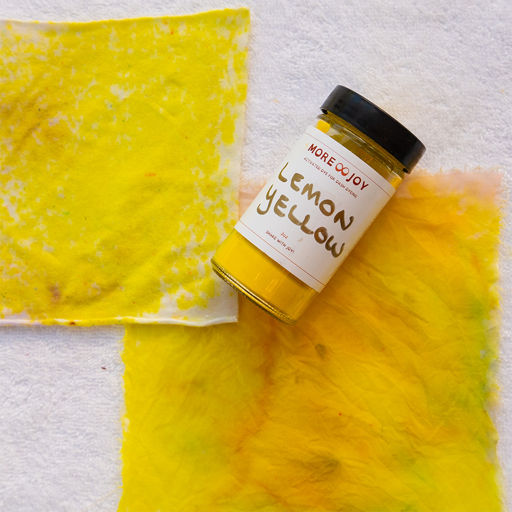
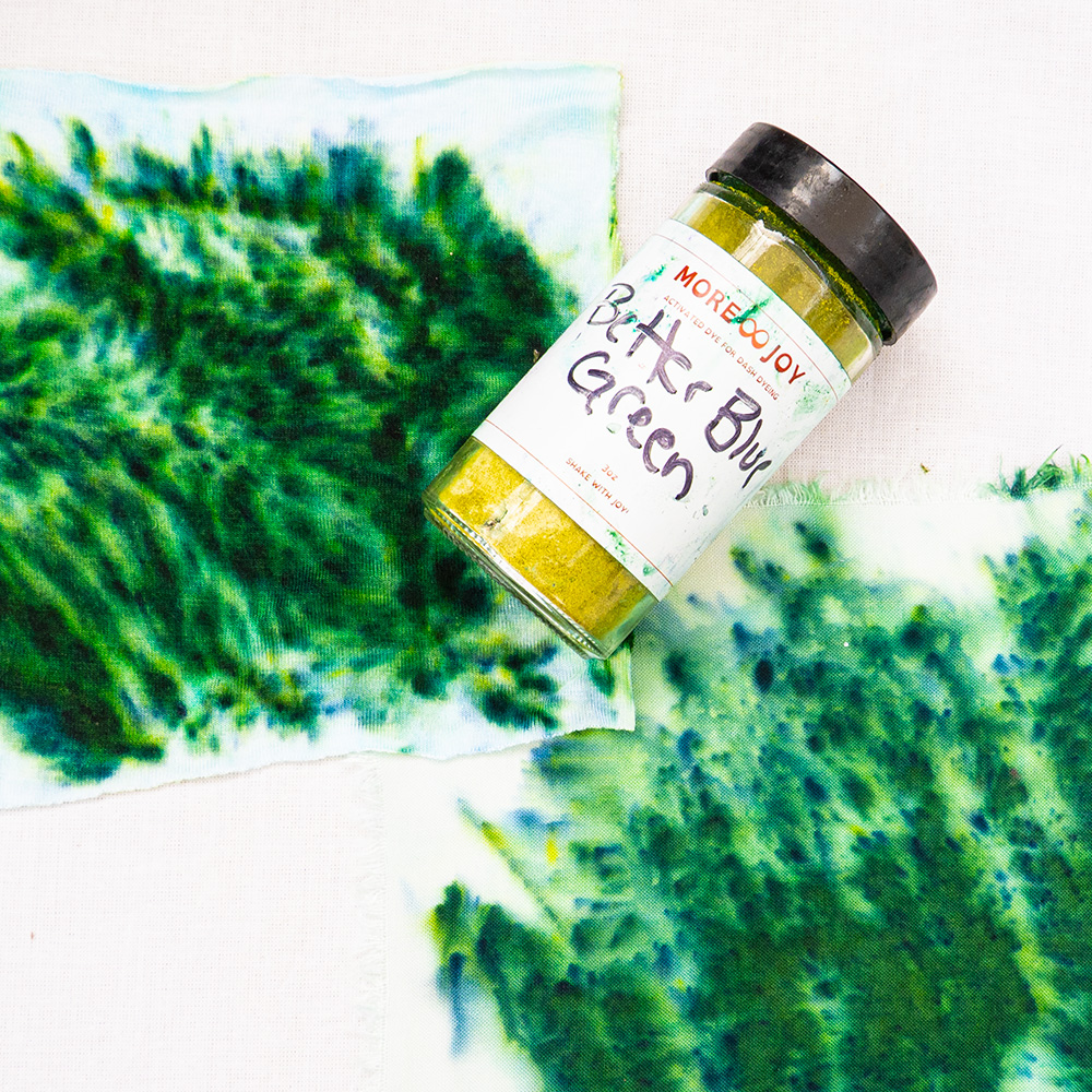
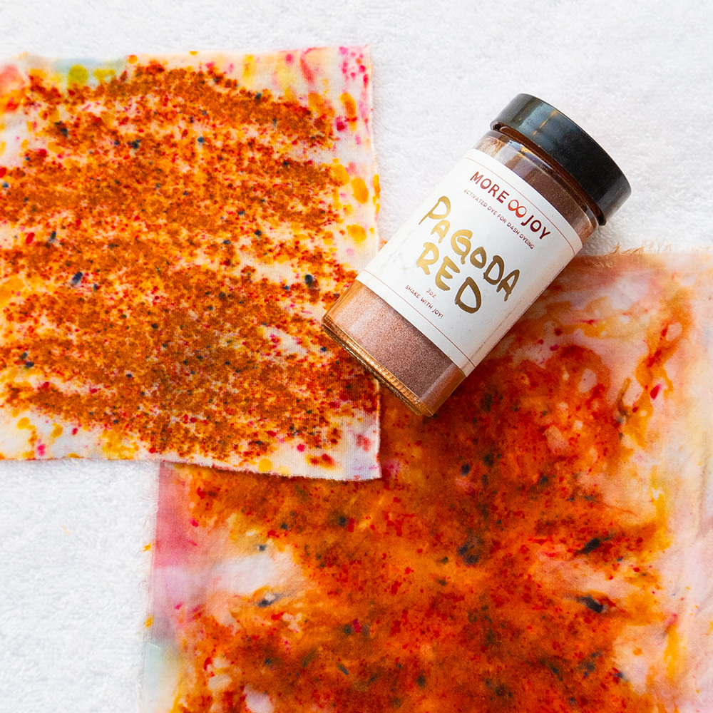
Spring colors are true hues: clear, bright and warm. They mirror blossoms, new shoots and wide-open skies. If clean, saturated color makes people tell you that you look rested, you may be a Spring.
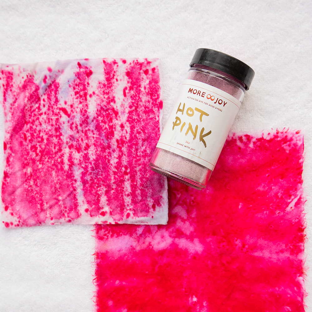
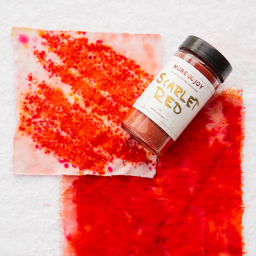
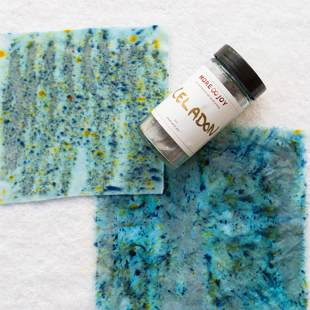
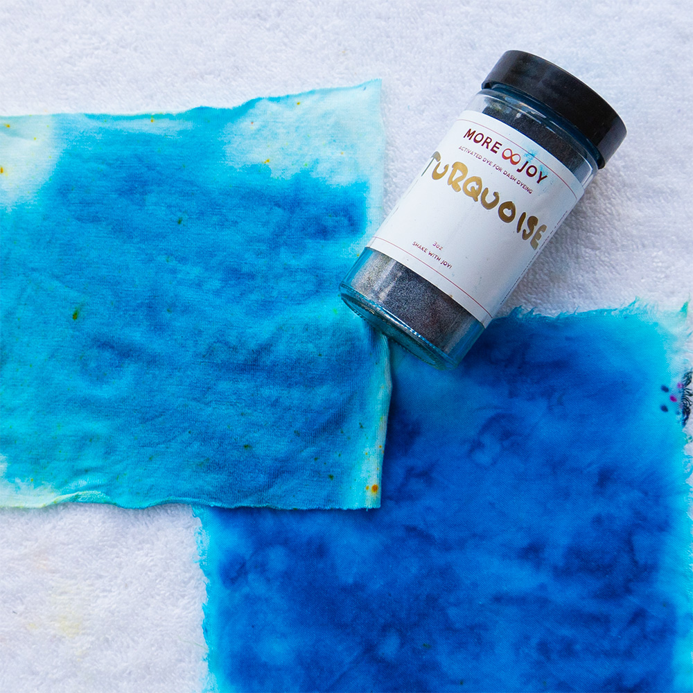
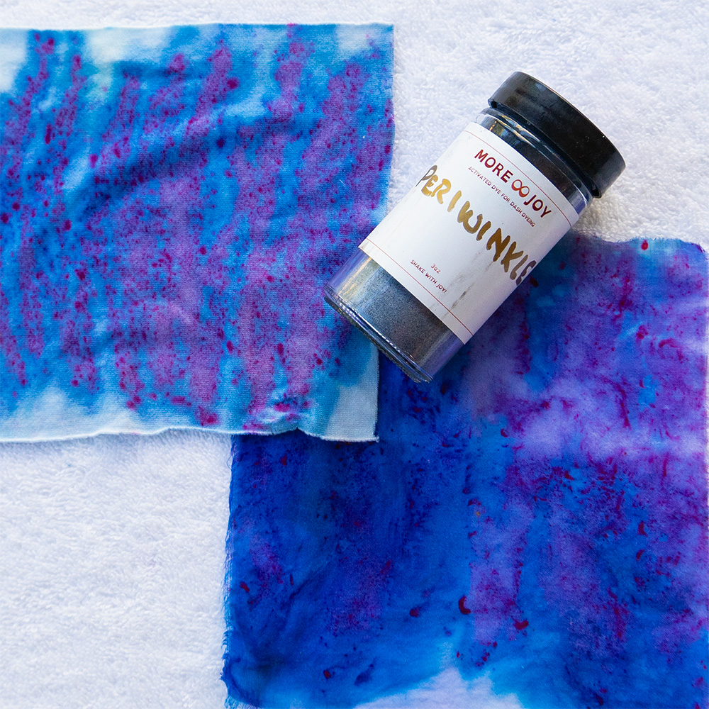
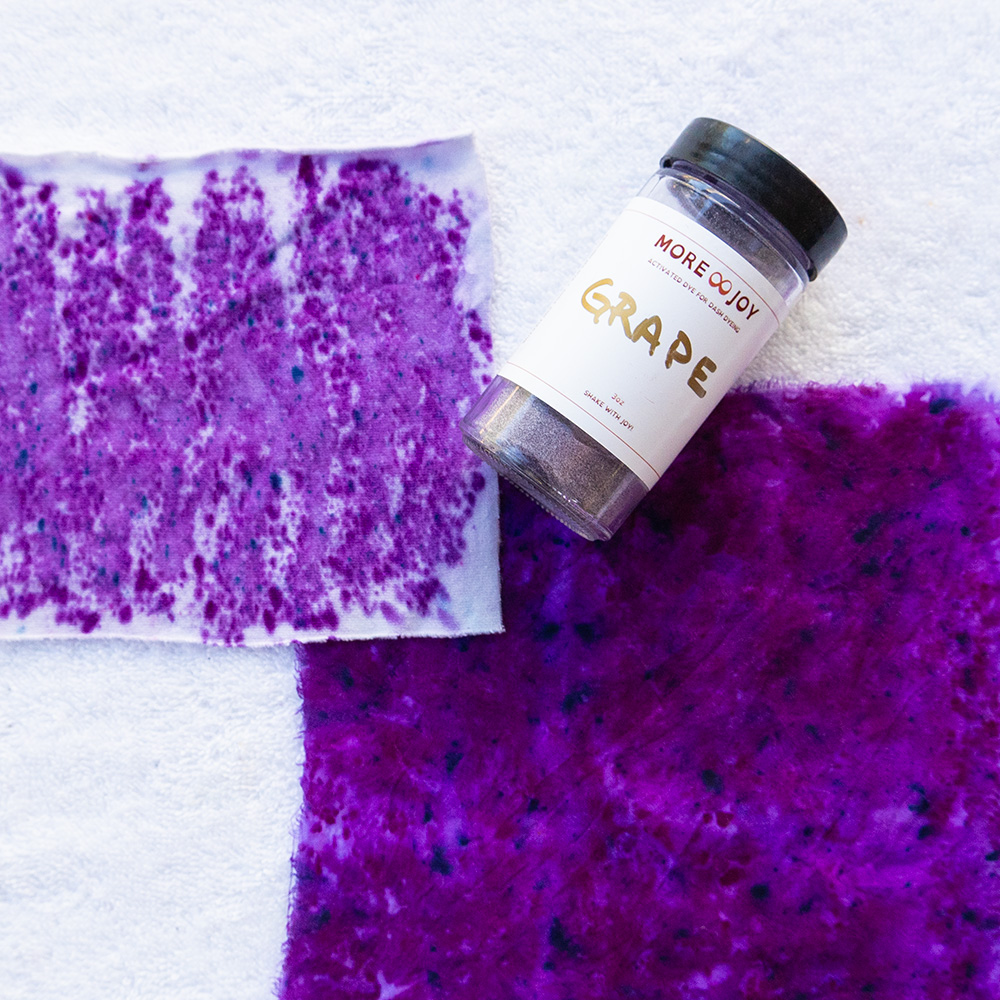
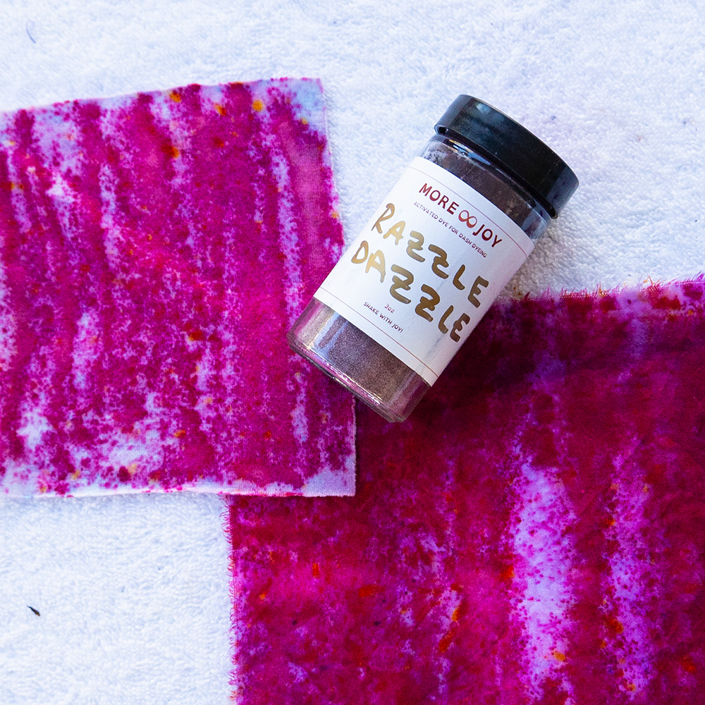
Summer · Tints (soft and airy)
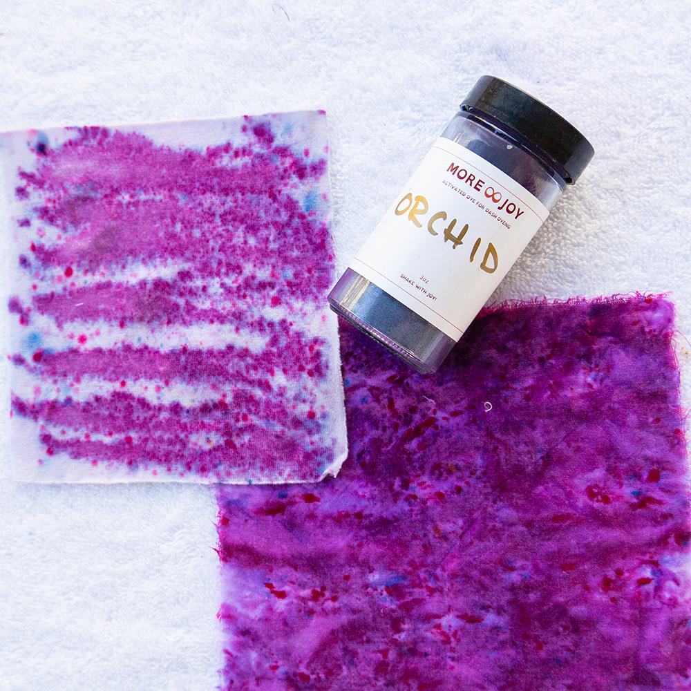
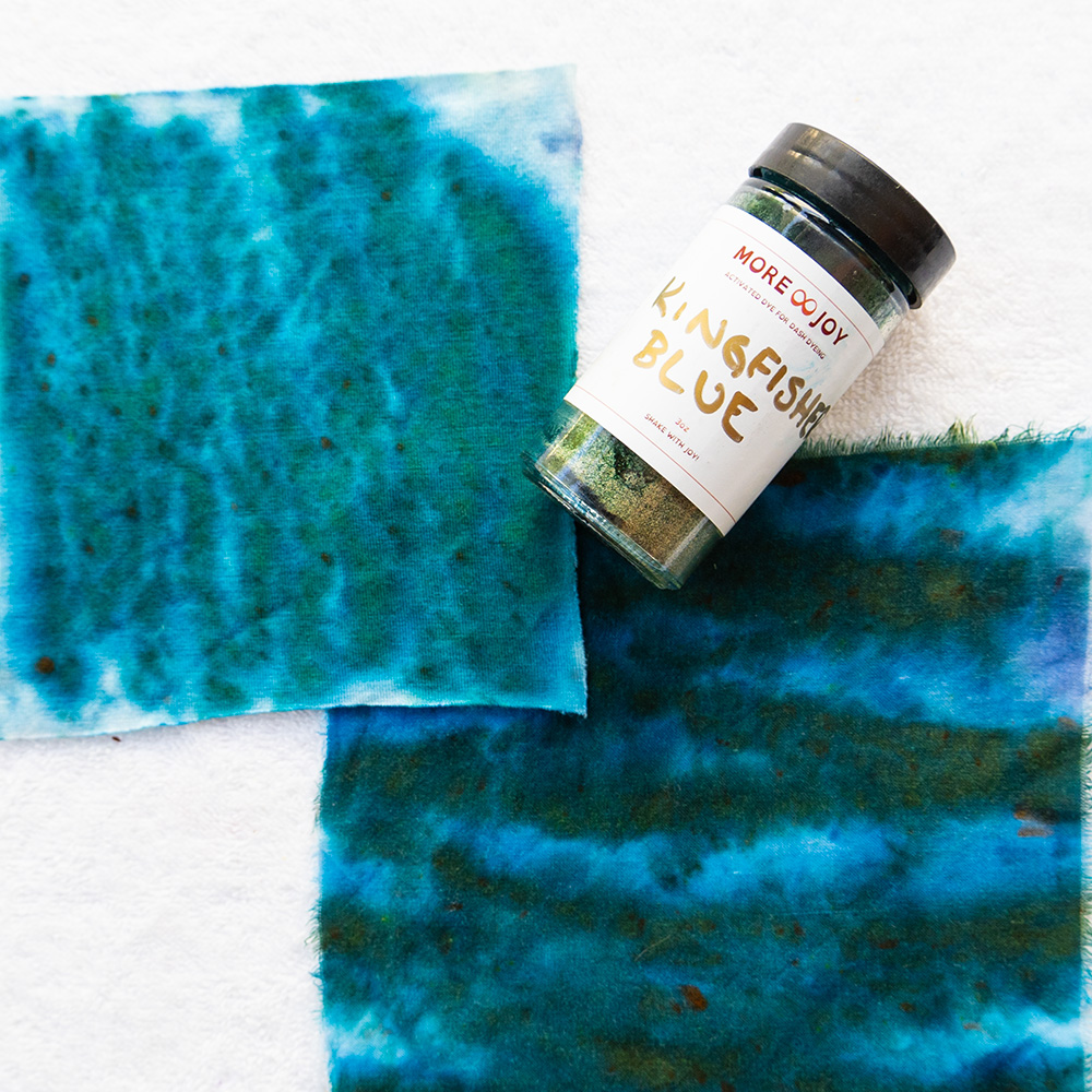
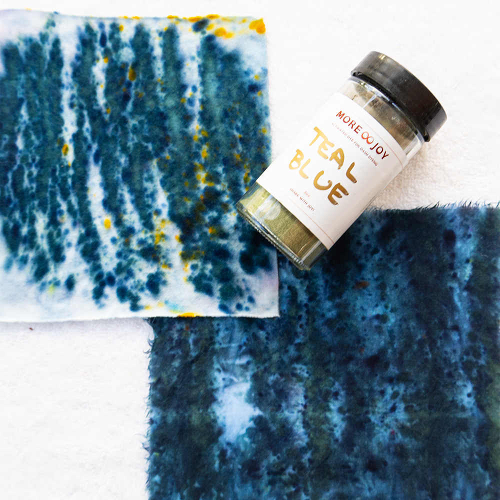
Summer colors are tints: cool colors lifted with white for a lighter, more delicate energy. They feel like mist, water and morning light. If soft colors make your eyes look clearer and bold ones seem to shout over you, you may be a Summer.
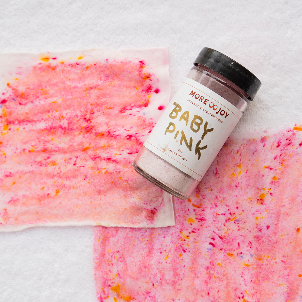
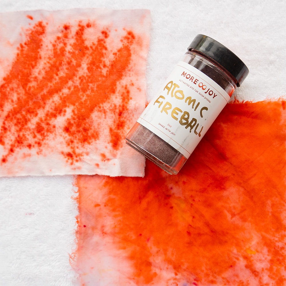
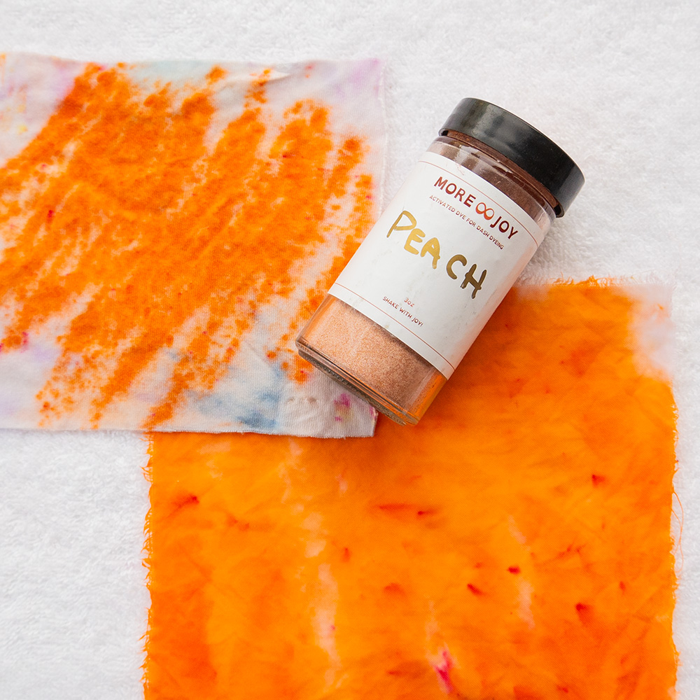
Autumn · Tones (rich and grounded)
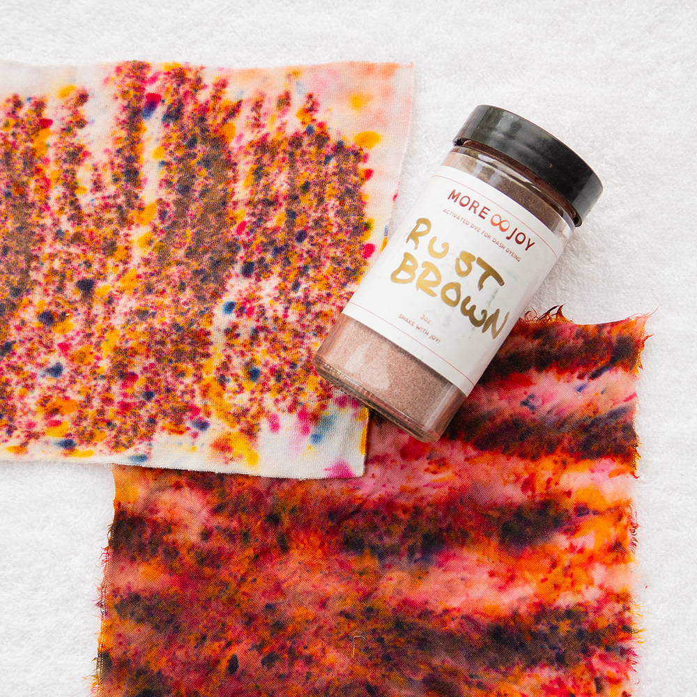
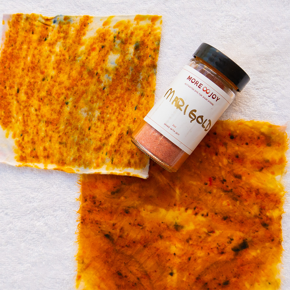
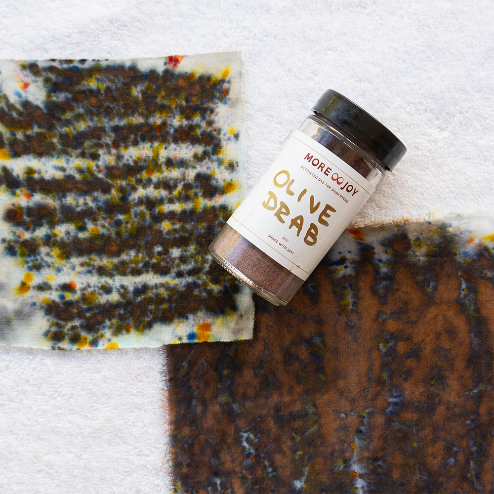
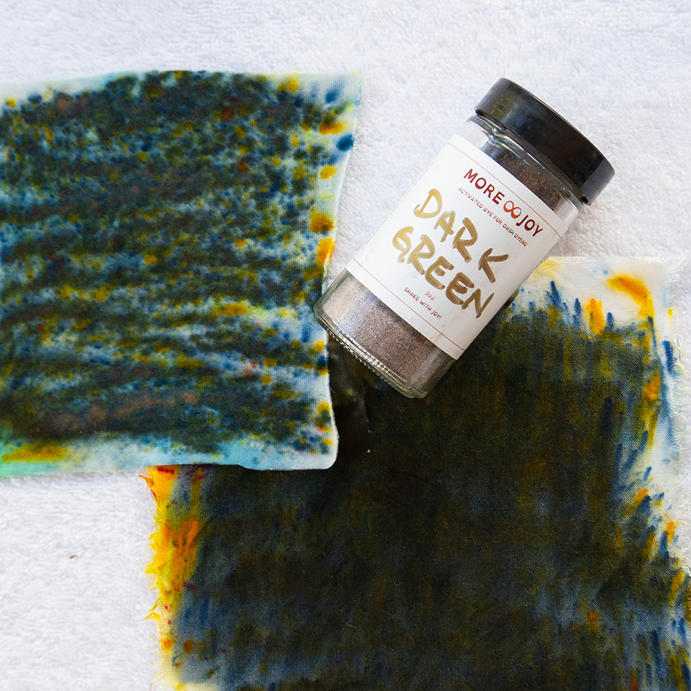
Autumn colors are tones: warm colors softened with gray or brown for richness and depth. They echo falling leaves, harvest fields and weathered wood. If rust and olive make you glow while neon washes you out, you may be an Autumn.
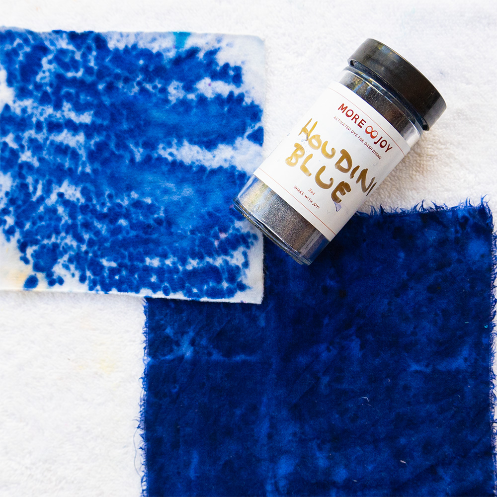
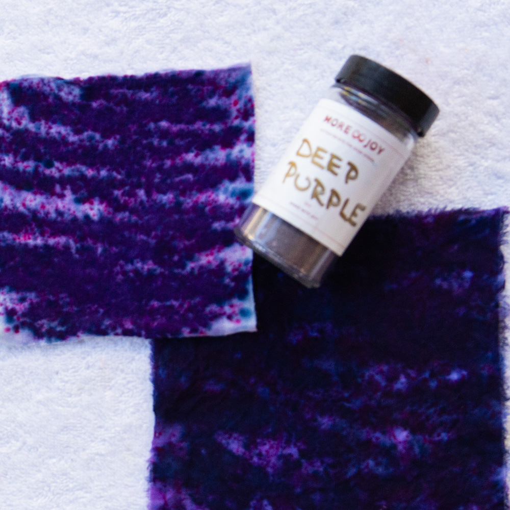
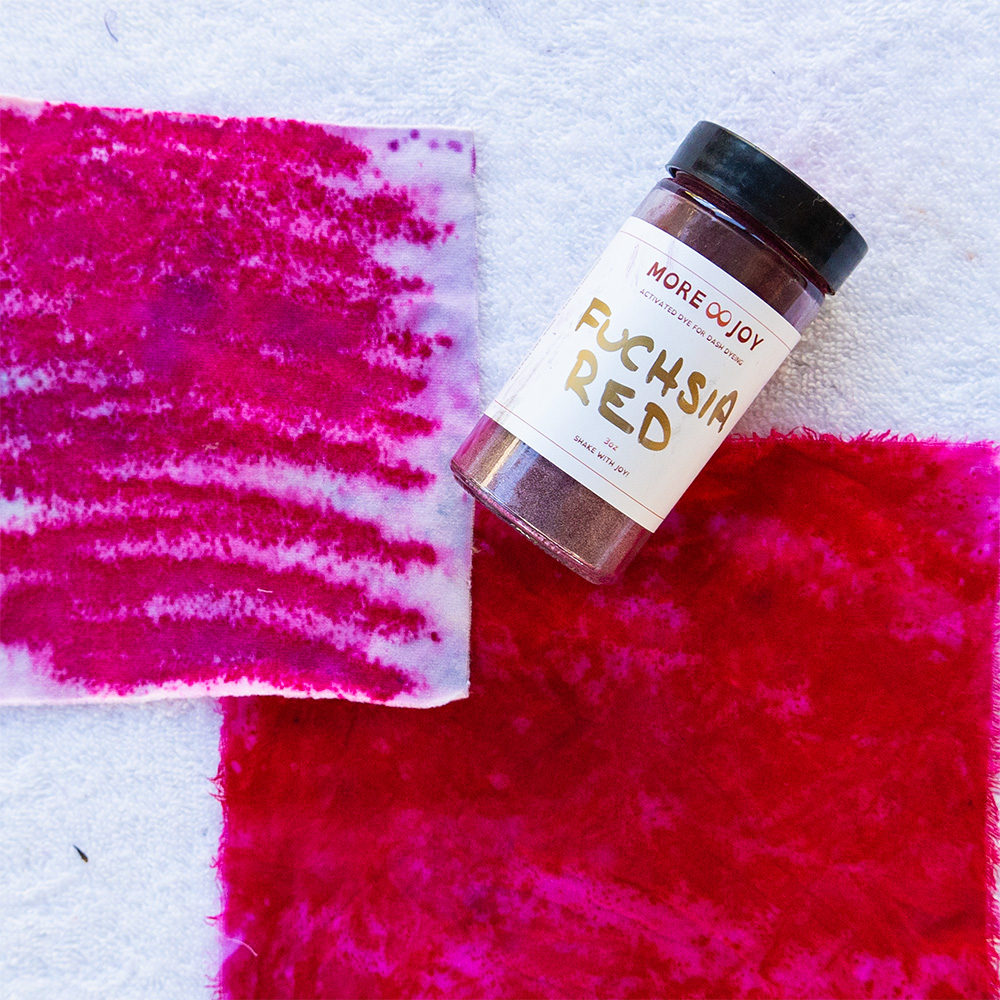
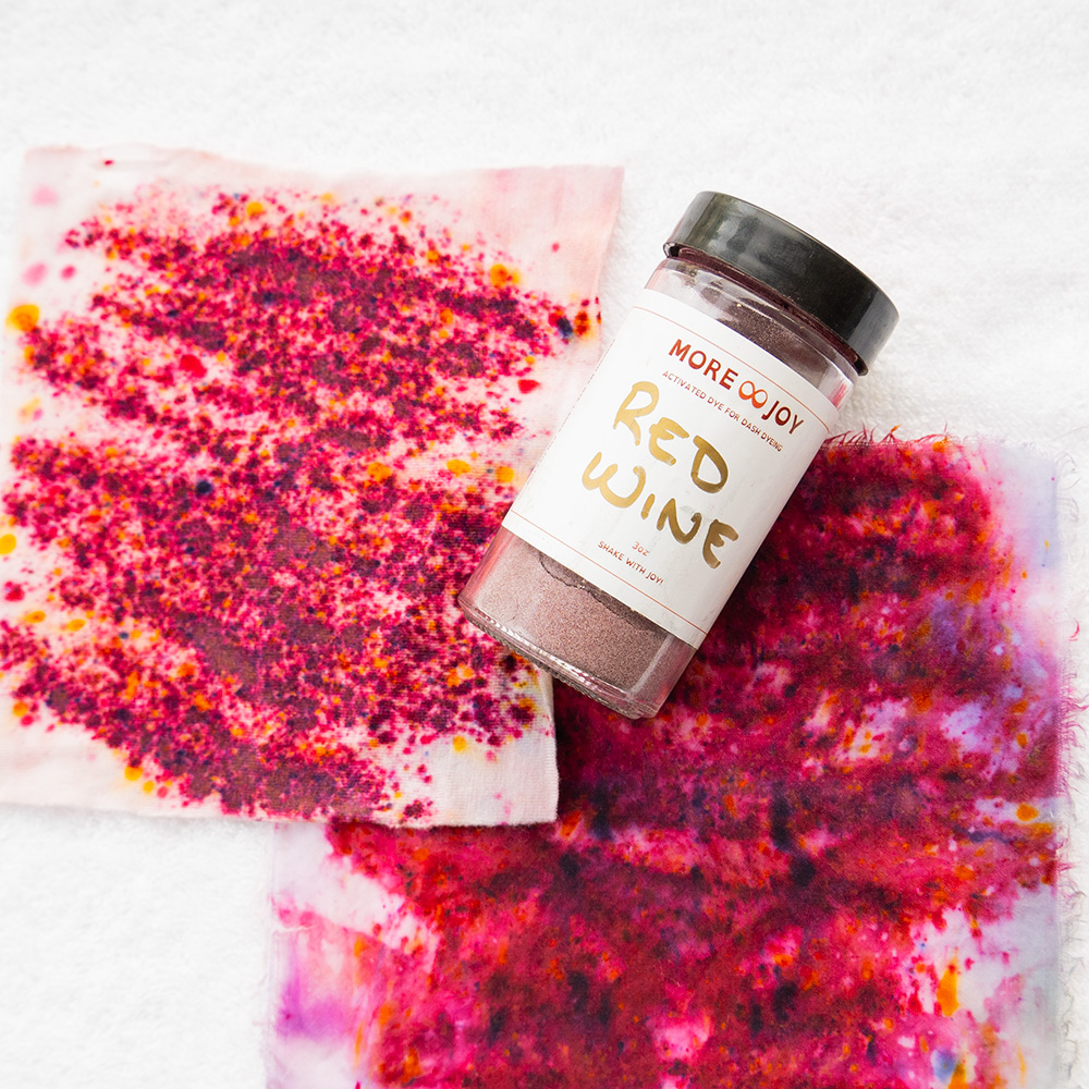
Winter · Shades (strong and dramatic)
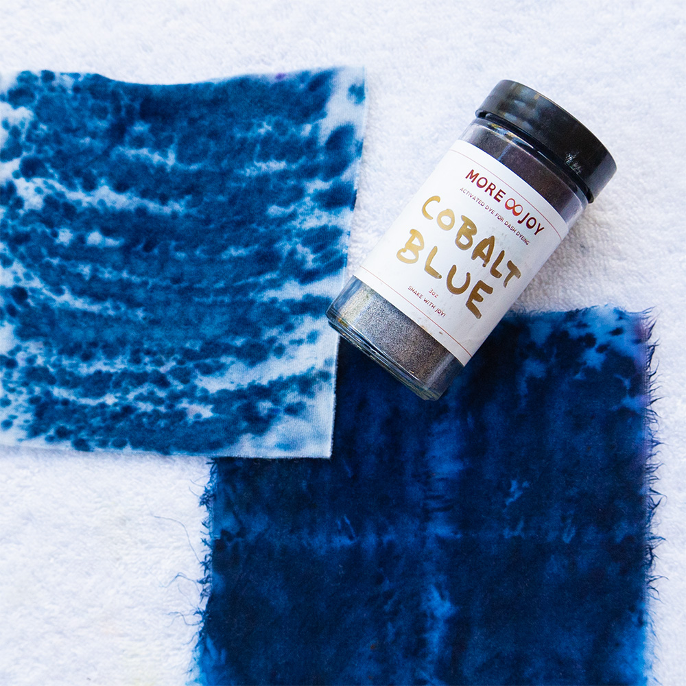
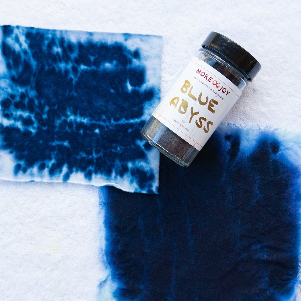
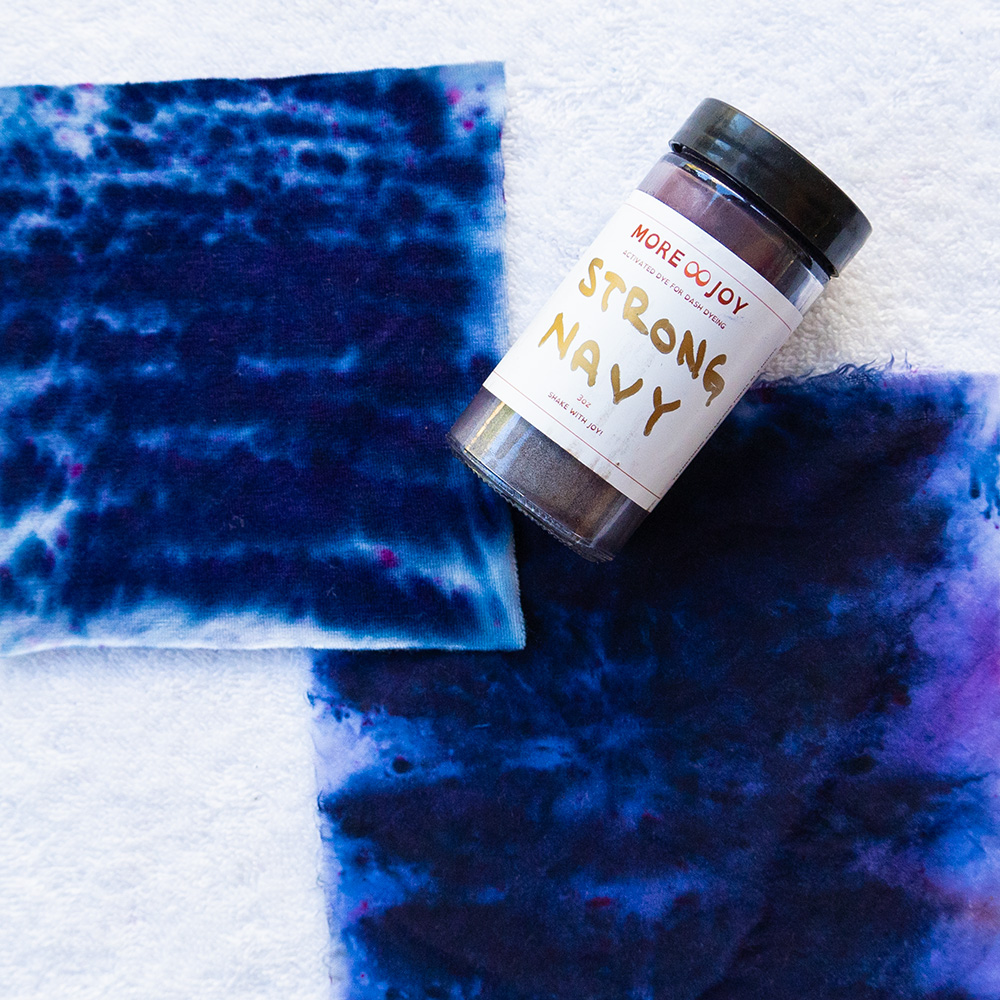
Winter colors are shades: cool colors deepened toward black for boldness and contrast. They feel dramatic, precise and a little mysterious. If jewel tones and crisp black make people notice your eyes, you may be a Winter.
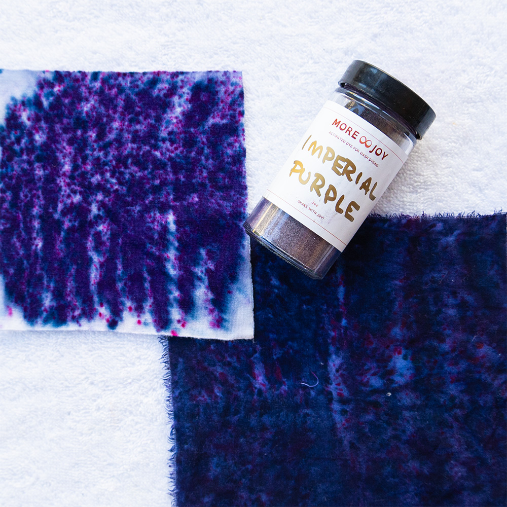
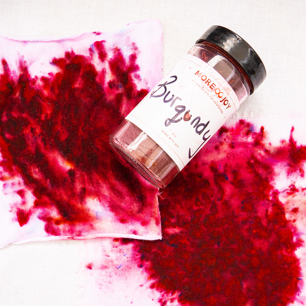
Finding your neutrals
Neutrals are the foundation builders of a wardrobe. They are the quiet companions that let your statement colors shine. Not every neutral works for every person, though. A Spring glows in camel and ivory, while a Winter looks crisp in charcoal and navy.
At More Joy, I sort neutrals into three groups so you can see where your base tones live:
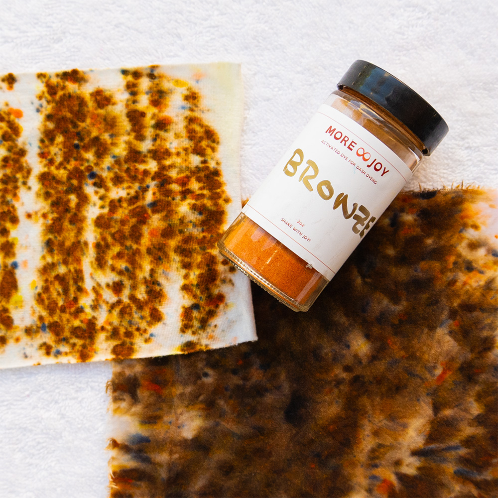
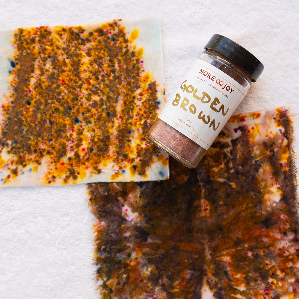
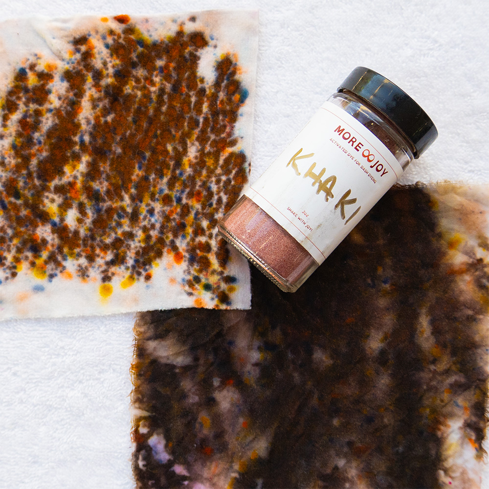
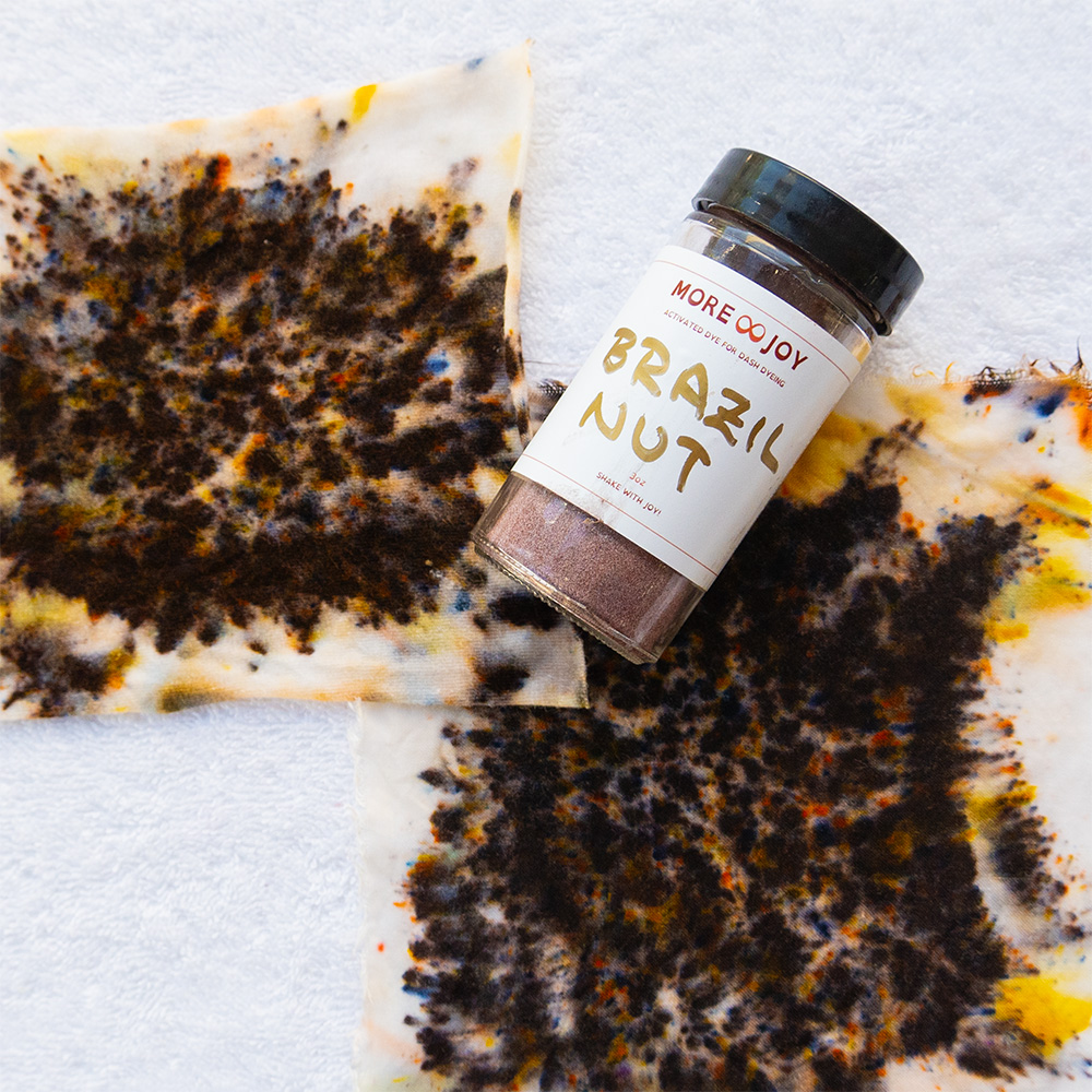
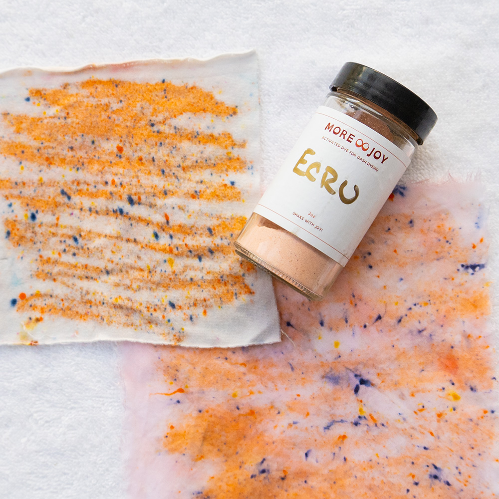
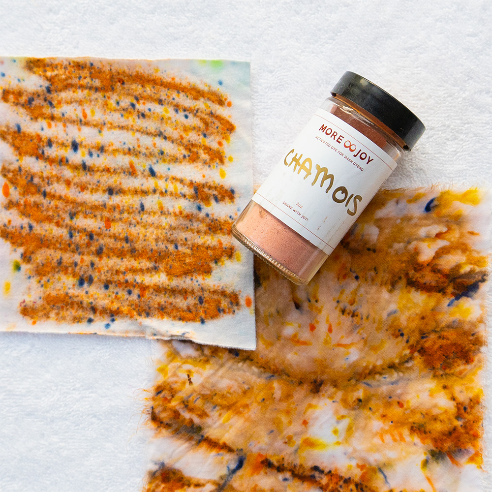
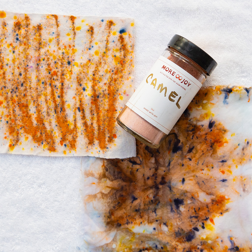
- Warm neutrals: ivory, ecru, camel, chamois and the golden browns
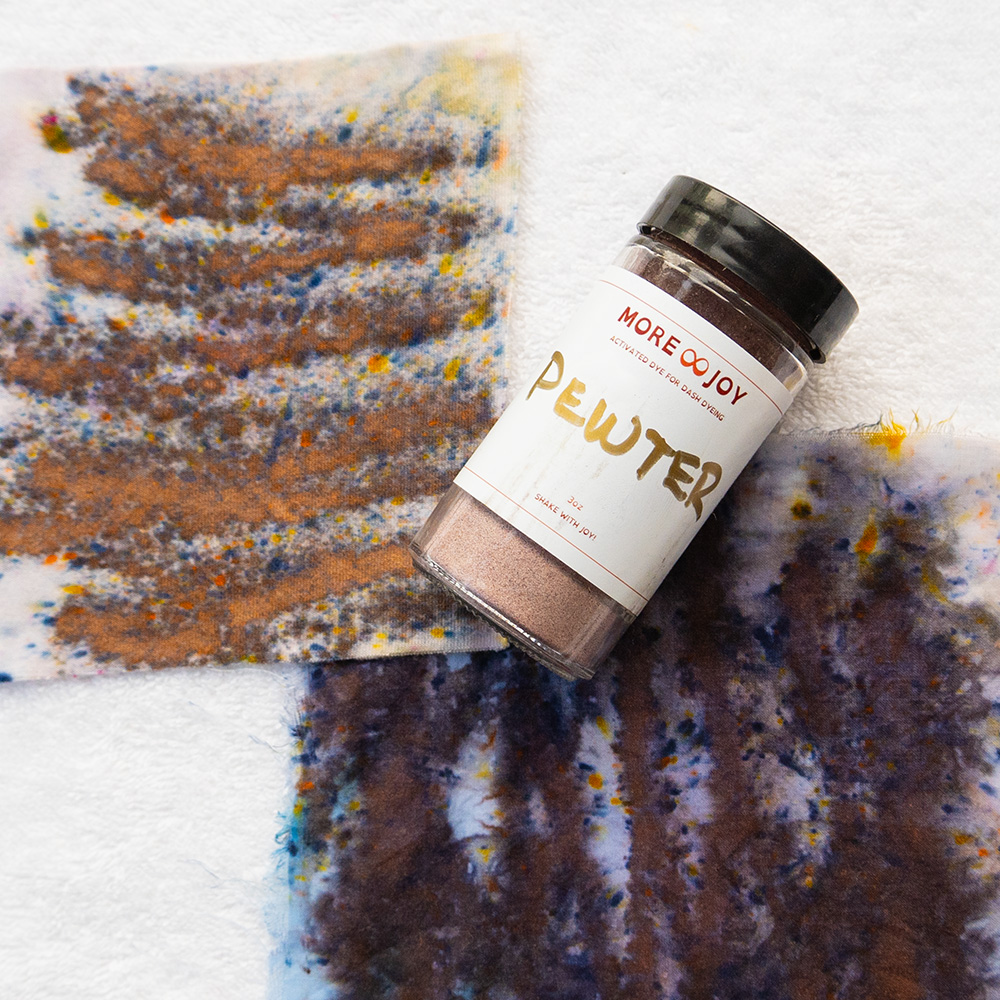
- Neutral neutrals: true grays and mushroom tones that sit in the middle
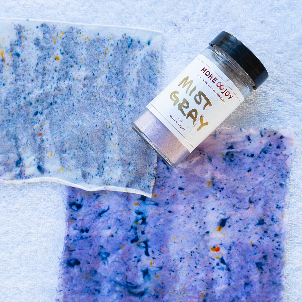
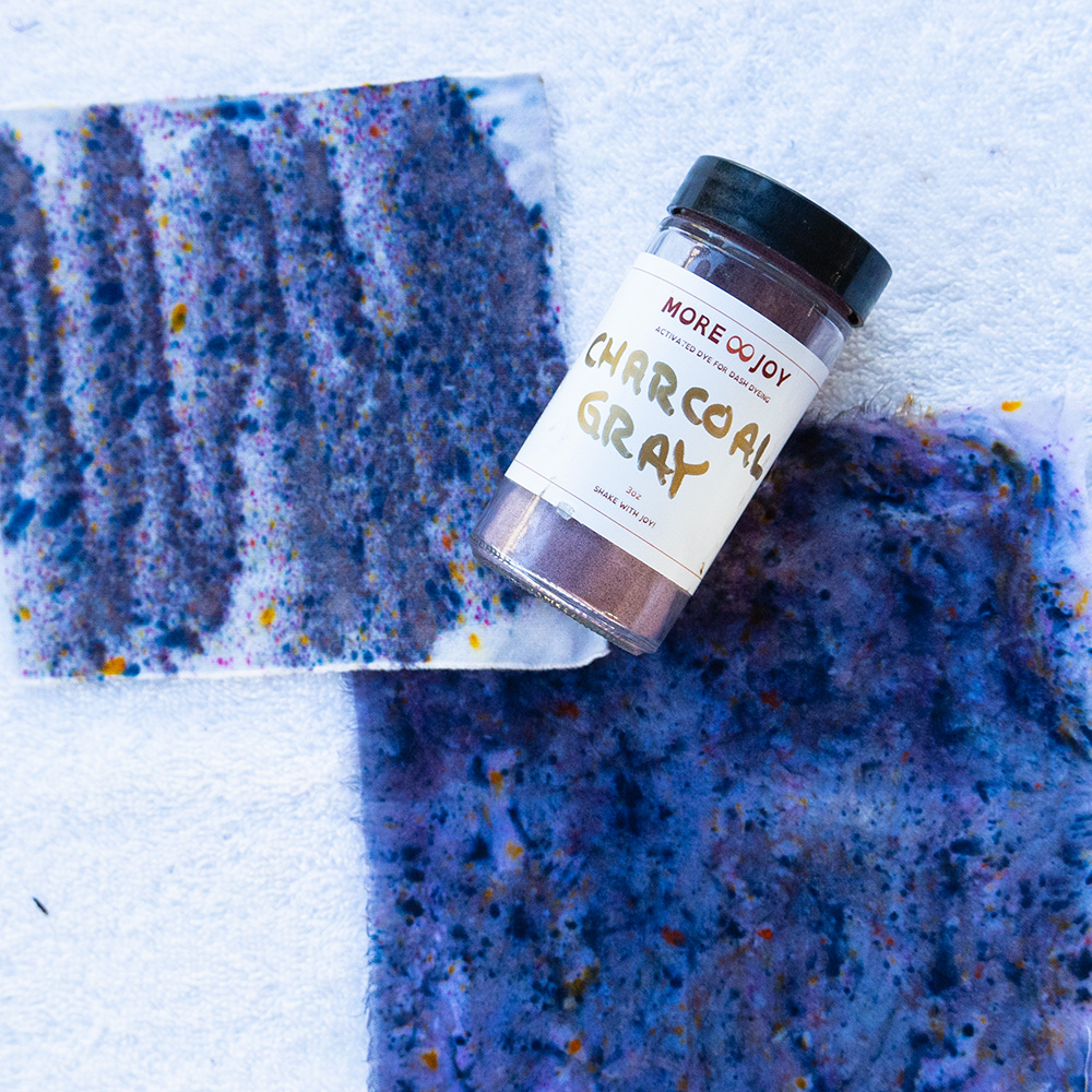
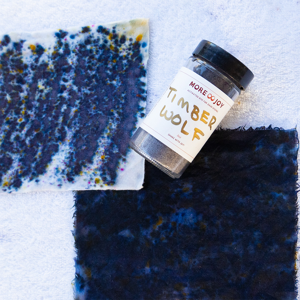
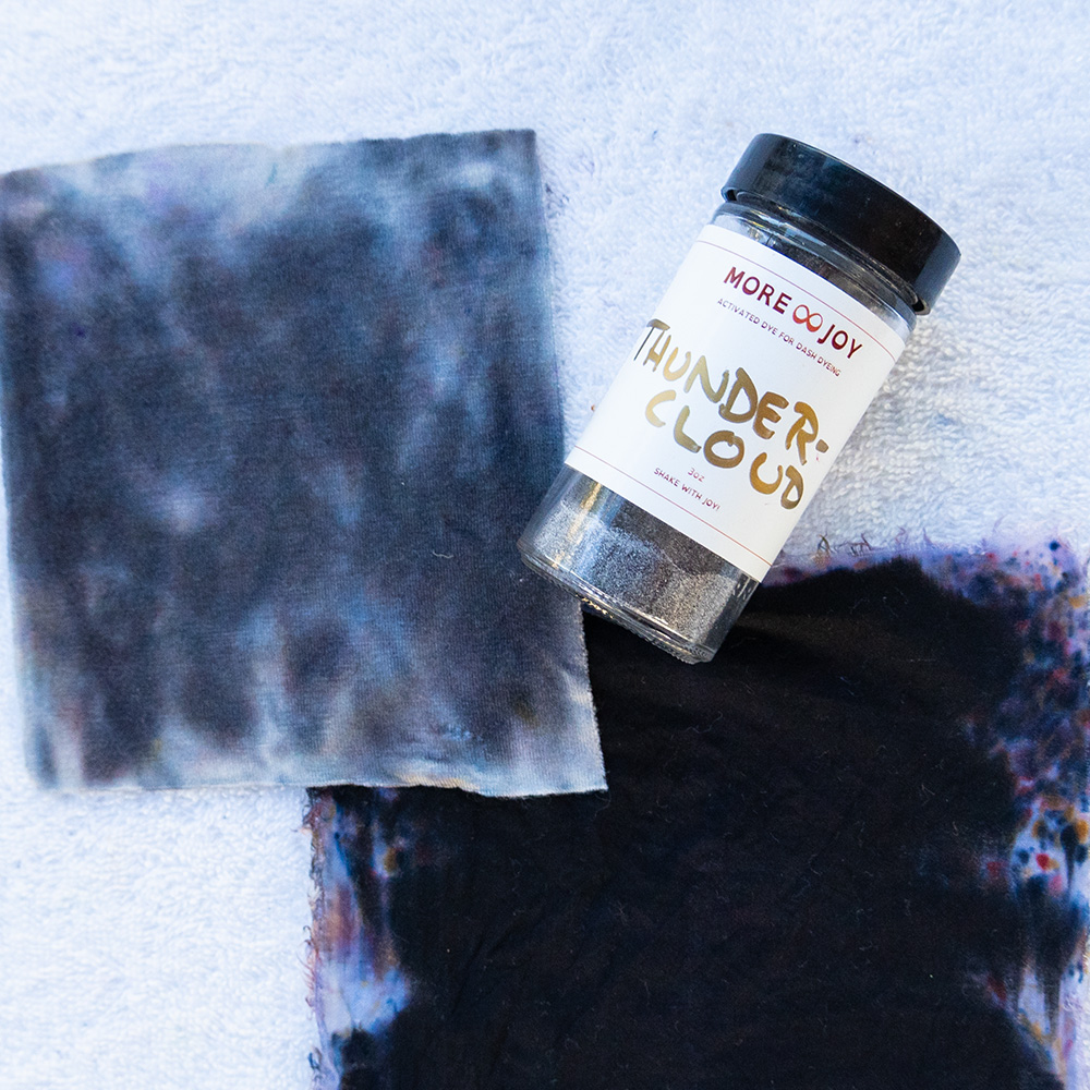
- Cool neutrals: mist gray, silver, blue-gray, charcoal and navy
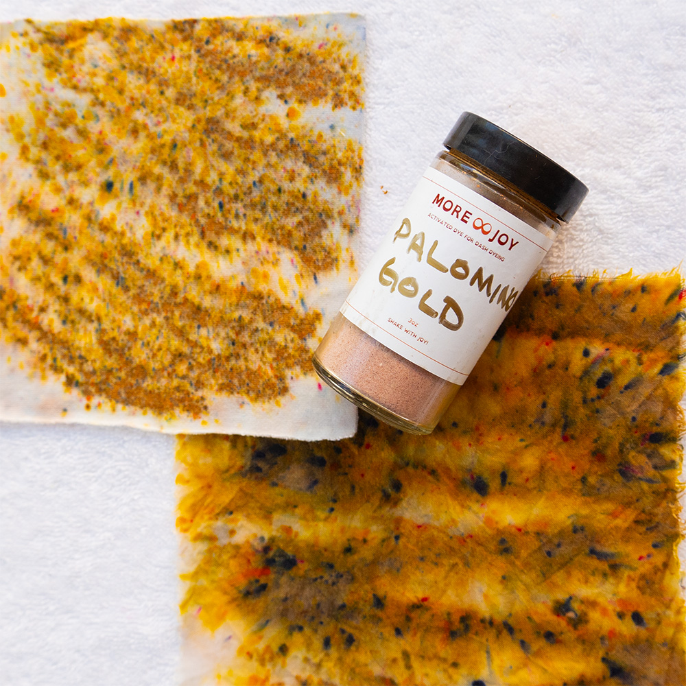
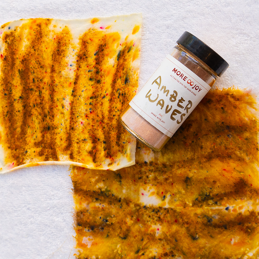


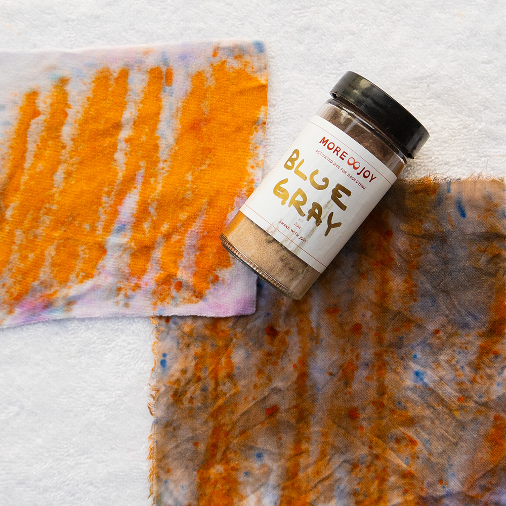
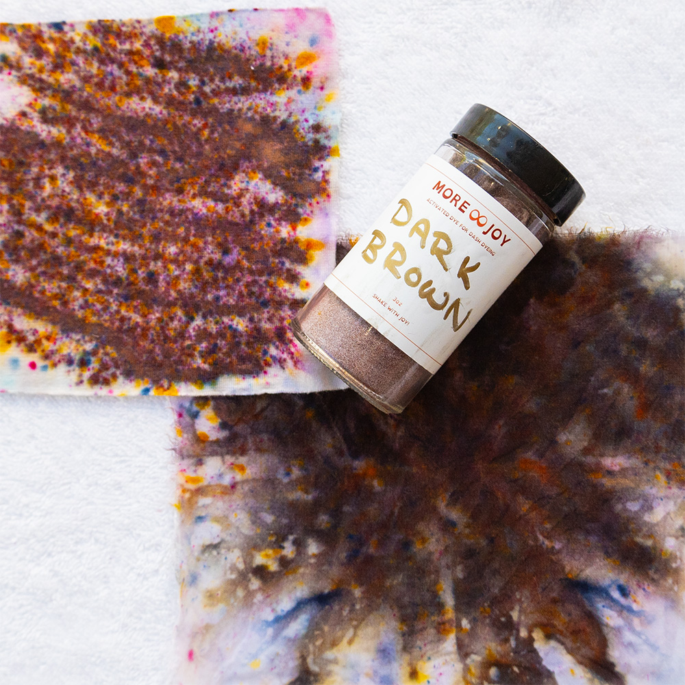
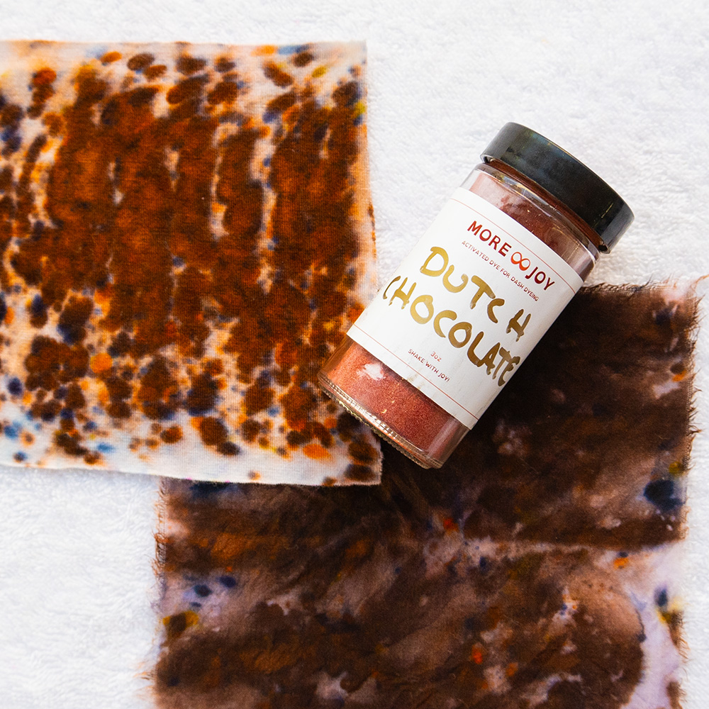
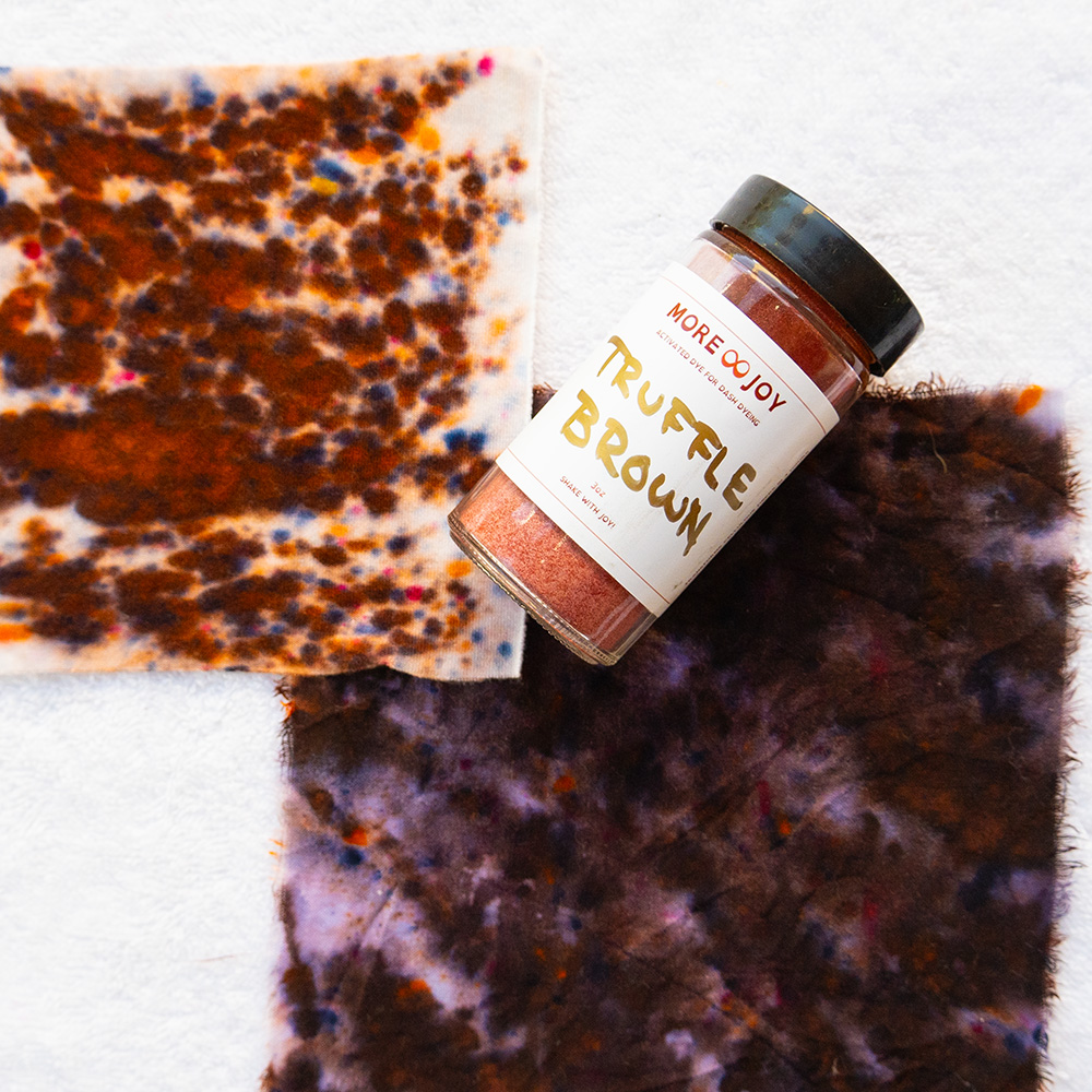
Try this
Pick one color you love, like a blue. Find four versions of it in your closet or online: a bright one, a pale one, a dusty one and a dark one. Hold each near your face in daylight. You will probably find that one or two of them make you light up while the others flatten you. That tells you more about your season than your favorite color ever could.
Let your palette evolve
Your season describes your natural coloring, and that stays fairly steady. But the state of color you crave can change with the season of your life. Someone stepping out of a hard year might need tints for a while. Someone stepping into leadership might reach for shades.
Your colors should change with you. If they never do, it is worth asking whether you are still dressing an old version of yourself.
Keep reading
Feel it against your own skin
Color makes the most sense on your body, not on a screen. In a Color Revival we swatch all 150 colors against your skin, map your palette and dye a small capsule you will actually wear.
More joy is possible.