
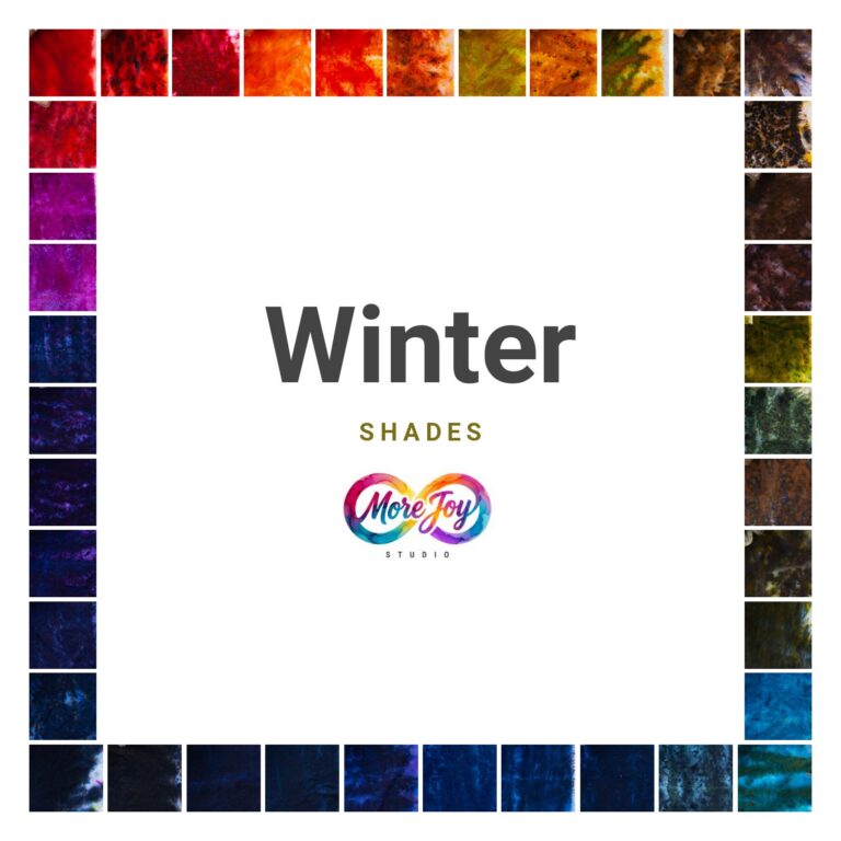
Winter is bold, clear and cool: the colors of contrast, depth and things that mean exactly what they say. Think fresh snow against a black branch, a cardinal on a gray day, deep water under ice. Winter colors are precise and powerful, and so is a Winter wearing them.
At a glance
- Undertone: cool, leaning blue
- Value: deep, with high contrast
- Chroma: high: clear jewel tones, never dusty
- Color theory: shades, color deepened with black (see Hues, Tints, Tones, and Shades)
You might be a Winter if…
- Silver and platinum look crisp on you
- Black and stark white wear well, not harsh
- Pastels and dusty colors make you look tired
- Jewel tones make people notice your eyes
- Orange and camel seem to drain the color from your face
Your color ecosystem
- Core: 110 Royal Blue · 065 New Emerald Green · 141 Magenta Galactica · 131 Imperial Purple
- Neutrals: 102 New Black · 099 Charcoal Gray · 120 Navy Blue
- Contrast pop: 149 Fuchsia Red
- Skip: orange, camel and muted earth tones
Wearing it
- Go for contrast: one dark, one vivid. Royal blue with black, emerald with charcoal.
- A single jewel tone against black is your signature.
- Keep lines clean. Sharp shapes and smooth fabrics echo your natural clarity.
- White is your friend. Unlike most seasons, you can wear stark white close to your face.
Dashing a Winter piece
Winter pieces want saturation. Use generous pigment and choose deep, clear colors: sapphire, emerald, magenta and violet. A splash of black or navy between jewel tones creates drama without muddying. Non-splitting colors like Fuchsia Red and Turquoise stay crisp and bold, which suits a Winter perfectly. Rayon makes jewel tones luminous.
The Winter palette
-

006 Burgundy
$8.00 Add to cart -
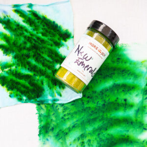
065 New Emerald Green
$8.00 Add to cart -
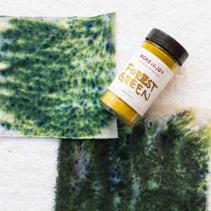
071 Forest Green
$8.00 Add to cart -
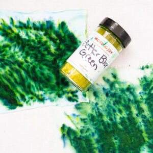
072 Better Blue Green
$8.00 Add to cart -

077 Aqua Marine
$8.00 Add to cart -

078 Kingfisher Blue
$8.00 Add to cart -

080 Turquoise
$8.00 Add to cart -

081 Bahama Blue
$8.00 Add to cart -

082 Caribbean Blue
$8.00 Add to cart -

083 Grecian Sea
$8.00 Add to cart -

084 Teal Blue
$8.00 Add to cart -

087 Peacock Blue
$8.00 Add to cart -

088 Stratosphere
$8.00 Add to cart -

090 Cobalt Blue
$8.00 Add to cart -

093 Cerulean Blue
$8.00 Add to cart -

094 Indigo Blue
$8.00 Add to cart -

095 Nebula Navy
$8.00 Add to cart -

096 Blue Abyss
$8.00 Add to cart -
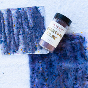
099 Charcoal Gray
$8.00 Add to cart -
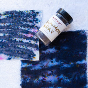
100 Gunmetal Gray
$8.00 Add to cart -
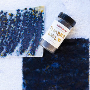
101 Timber Wolf
$8.00 Add to cart -
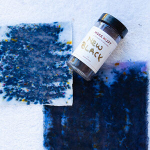
102 New Black
$8.00 Add to cart -
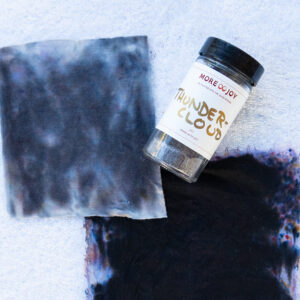
105 Thunder Cloud
$8.00 Add to cart -
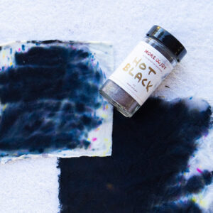
106 Hot Black
$8.00 Add to cart -
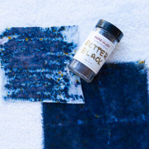
107 Better Black
$8.00 Add to cart -
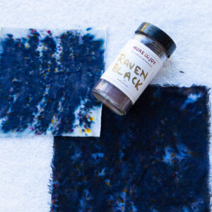
108 Raven Black
$8.00 Add to cart -

109 Bluebird
$8.00 Add to cart -

110 Royal Blue
$8.00 Add to cart -

111 Sapphire Blue
$8.00 Add to cart -

112 Blueberry
$8.00 Add to cart -

113 Strong Navy
$8.00 Add to cart -

114 Deep Space
$8.00 Add to cart -

118 Houdini Blue
$8.00 Add to cart -

119 Midnight Blue
$8.00 Add to cart -

120 Navy Blue
$8.00 Add to cart -

125 Ultra Violet
$8.00 Add to cart -

126 Nightshade
$8.00 Add to cart -

128 Grape
$8.00 Add to cart -

129 Plum
$8.00 Add to cart -

130 Deep Purple
$8.00 Add to cart -

131 Imperial Purple
$8.00 Add to cart -

132 Power Berry
$8.00 Add to cart -

135 Blue Violet
$8.00 Add to cart -

136 Red Violet
$8.00 Add to cart -

137 Black Cherry
$8.00 Add to cart -

138 Eggplant
$8.00 Add to cart -

141 Magenta Galactica
$8.00 Add to cart -

142 Amethyst
$8.00 Add to cart -

143 Raspberry
$8.00 Add to cart -

149 Fuchsia Red
$8.00 Add to cart -

150 Dances With Raisins
$8.00 Add to cart
Not sure yet?
Your season is a starting point, not a rulebook. A Winter with softer coloring borrows from Summer. A Winter with a warmer lean borrows from Autumn. The fastest way to know is to hold the swatches against your skin.
Keep reading
Feel it against your own skin
Color makes the most sense on your body, not on a screen. In a Color Revival we swatch all 150 colors against your skin, map your palette and dye a small capsule you will actually wear.
More joy is possible.