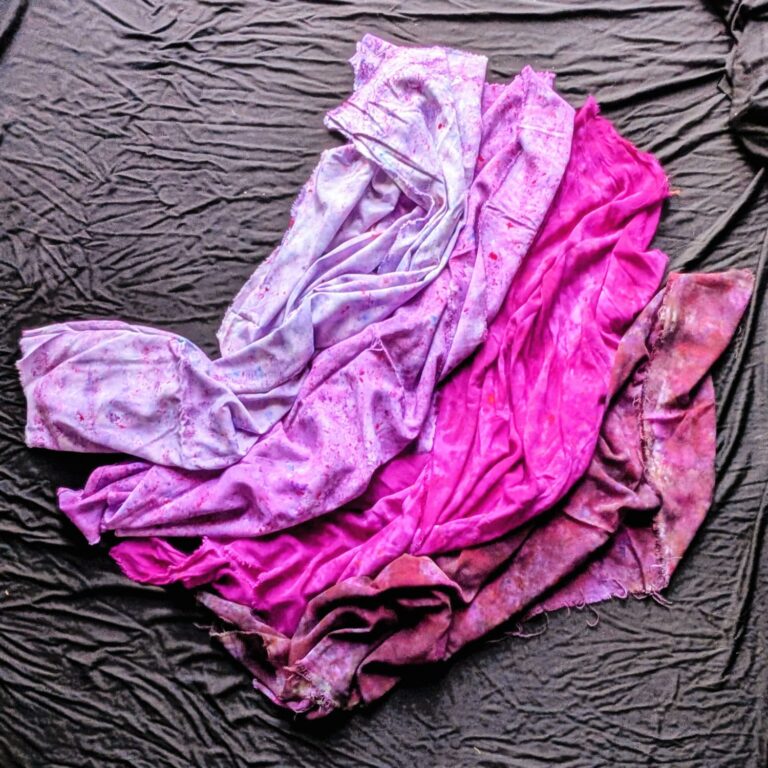
Blue is not just blue. It can be airy like a morning sky, muted like sea glass, deep like midnight or electric like a kingfisher’s back. Same family, completely different feeling. What changes is how much white, gray or black is mixed in.
Painters describe those changes with four words: hue, tint, tone and shade. Once you can see them, you’ll never look at a rack of clothes the same way again.
Value and chroma: the second and third dials
In Color Temperature, we looked at the first dial: whether a color leans warm or cool. The other two dials are:
- Value: how light or dark a color is. Pale pink and burgundy can be the same family with very different values.
- Chroma: how bright and clear a color is, or how soft and muted. Neon lime and olive drab are both yellow-greens, but one has high chroma and one has low.
Together with temperature, these three dials can describe any color in the world.
Hue: the pure color


A hue is color with nothing added: clear, saturated and bright. Daffodil, Hot Pink and Lime Squeeze are hues. Hues have the highest chroma, which is why they catch the eye from across a room.
How it feels: awake. Hope, beginnings and energy that wants to move.
Wear it when: you want to be seen, you need a lift, or you’re celebrating something.
Tint: the color plus white


A tint is a hue lifted with white. It is lighter, softer and more delicate. Powder Pink, Ice Blue and Wisteria are tints. “Pastel” is another word for a tint.
How it feels: gentle. Lightness, openness and ease.
Wear it when: you want to feel approachable, you’re easing back into color after a hard season, or bright colors feel like too much.
Tone: the color plus gray


A tone is a hue softened with gray. It is muted, complex and earthy, with lower chroma. Olive Drab, Rust Brown and Marigold sit here. Many of the colors people call “sophisticated” are tones.
How it feels: thoughtful. Reflection, nuance and the comfort of something lived-in.
Wear it when: you want calm confidence, you’re working a long day, or you want color without attention.
Shade: the color plus black


A shade is a hue deepened with black. It is richer and more dramatic. Black Cherry, Imperial Purple and Teal Blue are shades. Jewel tones are usually shades.
How it feels: powerful. Depth, focus and introspection.
Wear it when: you’re stepping into authority, you want to feel held, or it’s evening and the light is low.
Reading any color with three dials
Put temperature, value and chroma together and you can describe any color in my collection:
- Coral Pink is warm, light-to-medium and bright.
- Sage Green is cool-leaning, medium and soft.
- Raven Black is cool, deep and soft.
- Tangerine is warm, medium and bright.
When you start describing colors this way, you’ll notice that the colors you love share a pattern. Maybe you’re drawn to soft colors in every family. Maybe you always choose deep ones. That pattern is the heart of your season.
Value and contrast in an outfit
Value also explains why some outfits look striking and others look calm.
- High contrast (light and dark together, like ivory and navy) reads as bold and graphic.
- Low contrast (similar values, like blush and camel) reads as soft and cohesive.
People with strong natural contrast, such as dark hair with light skin, often look best in high-contrast outfits. People with softer natural contrast often glow in lower contrast. Neither is better. Match the outfit to the person.
Every state has a season of life
None of the four states is better than another. They are different moods, and you’ll need different ones at different times. Someone stepping out of a hard year might want tints for a while. Someone stepping into leadership might reach for shades. Someone grieving might find comfort in tones. Let your wardrobe change with you.
Try this
Pick one color you love. Find four versions of it in your closet or your home: a bright one, a light one, a muted one and a dark one. Lay them side by side and notice which version your body relaxes toward. That’s the state you need right now.
Color Revival
Feel it against your own skin
Color makes the most sense on your body, not on a screen. A Color Revival starts with getting to know you. We take a snapshot of your wardrobe, then use my bird books, the elements or color theory as a guide to dye six pieces that mix and match, shining your right light. Or start at home with activated dyes, ready to dash with just water.
More joy is possible.