
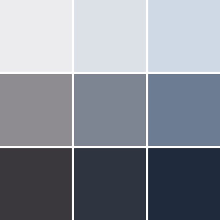
Cool neutrals are the quiet colors with blue or violet in them: bright white, silver, every gray, taupe, charcoal and black. They close the color library because they hold every cosmic cool color together.
Cool Neutrals are one of the cosmic cool colors, with cyan, blue, purple and magenta. Together they are the home colors of Summers and Winters. See all ten on the color wheel in Color Families.
Neutrals are the quiet colors that let everything else speak. Ivory, ecru, camel, beige and gray are the foundation of most wardrobes, but no neutral is truly neutral. Every one leans warm or cool, and choosing the right ones changes everything.
This post is part of my Color Library, where I go deep on one color at a time. Black has its own post: Black. For the big picture of every color family, start with The Color Spectrum.
Cool neutrals from light to deep
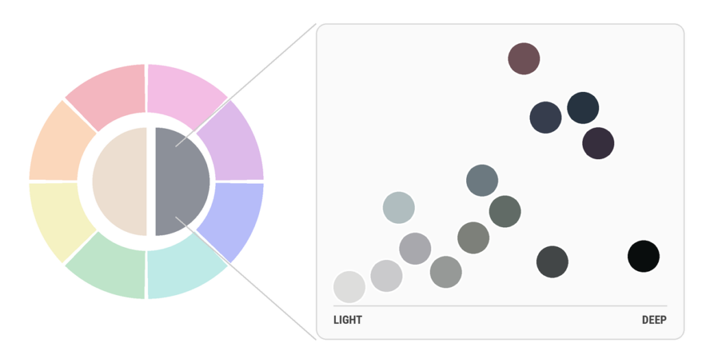
Cool neutrals carry blue or violet: bright white and silver, taupe and slate, charcoal and true black. Read the dots from left to right and watch the value deepen.
Light
Deep
Find your cool neutrals by skin tone
Every color family has a version for every skin tone, and a depth that matches yours. Find your zone, then follow your skin’s depth across: lighter skin, lighter shade; deeper skin, deeper shade.
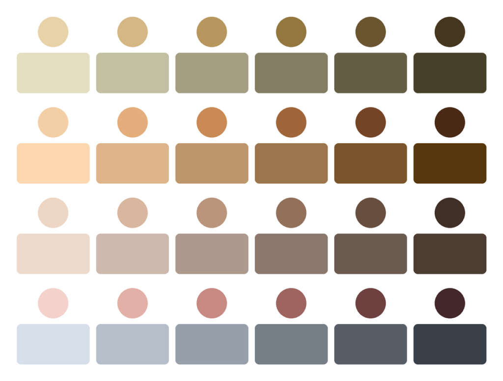
Top to bottom: olive, warm, soft neutral and cool skin. In each row, skin from light to deep sits above its best neutrals. Find your row, then your depth.
Here are my dyes for each skin tone:
- Warm skin: 046 Ivory, 045 Ecru
- Cool skin: 040 Blue Gray, 144 Timber Wolf
- Olive skin: 039 Pewter, 145 Gunmetal Gray
- Soft Neutral skin: 046 Ivory, 045 Ecru, 040 Blue Gray, 039 Pewter, 139 Mist Gray, 140 Silver Lining, 141 Neutral Gray, 142 Brushed Steel, 143 Charcoal Gray
Every cool neutral in my collection
Every one of my dyes in this color. Tap a shade to see its hex code, or add it to your cart.
Cool neutrals by color genre
Every color can be light or deep, soft or clear. Here’s neutrals in all nine color genres. Learn all nine in Color Genres.
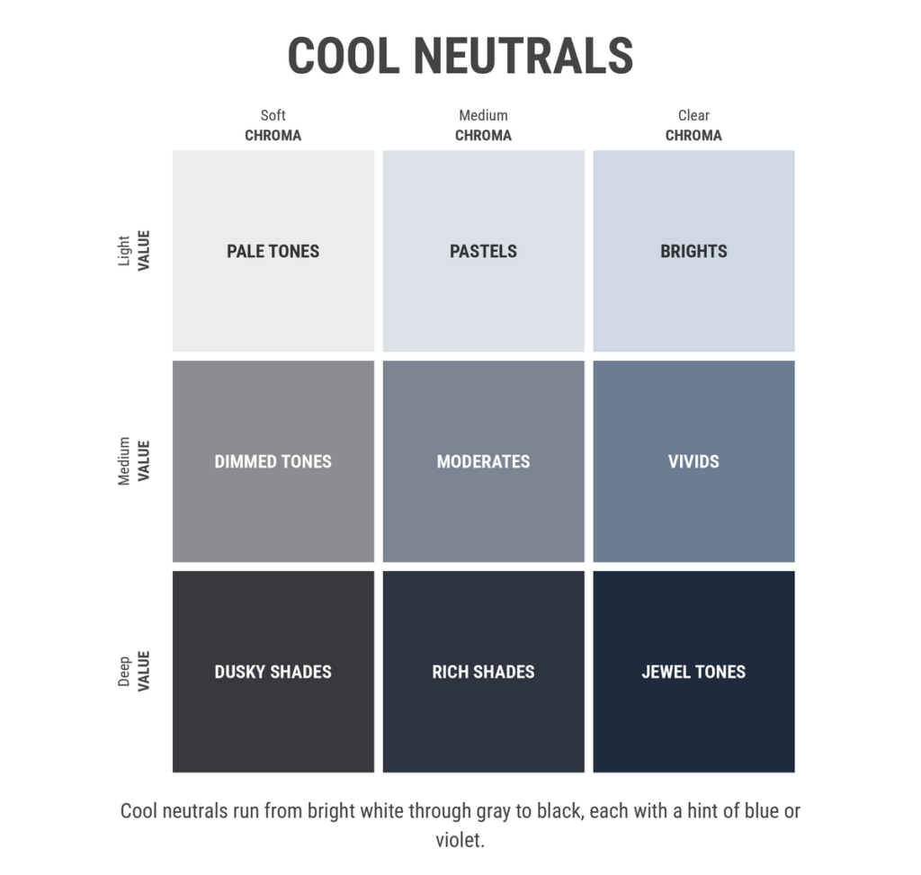
My best matches in each genre, top row to bottom:
- Pale Tones: 045 Ecru, 046 Ivory, 139 Mist Gray, 140 Silver Lining
- Pastels: none of my neutrals dyes yet. Closest: 045 Ecru
- Brights: none of my neutrals dyes yet. Closest: 045 Ecru
- Dimmed Tones: 039 Pewter, 040 Blue Gray, 141 Neutral Gray, 142 Brushed Steel, 143 Charcoal Gray
- Moderates: none of my neutrals dyes yet. Closest: 142 Brushed Steel
- Vivids: none of my neutrals dyes yet. Closest: 142 Brushed Steel
- Dusky Shades: 144 Timber Wolf, 145 Gunmetal Gray
- Rich Shades: none of my neutrals dyes yet. Closest: 145 Gunmetal Gray
- Jewel Tones: none of my neutrals dyes yet. Closest: 145 Gunmetal Gray
What colors go with cool neutrals?
Anyone can make a pretty palette. These are made from my dyes, so you can see how each pairing dash-dyes. Each harmony comes in a light set and a deep set of four. Tap a swatch for its hex code, or add it to your cart. The why behind each one is in Color Harmony.
Monochromatic
One color family in different values. The calmest way to wear a lot of neutrals: same color, different depths.
Light
Deep
Analogous
Neighbors on the color wheel. They share a little of each other, so they blend into one mood.
Light
Deep
Complementary
Opposites on the color wheel make each other brighter. Let one lead and use the other as the accent.
Light
Deep
Split complementary
Neutrals with the two colors beside its opposite: the energy of opposites with a softer landing.
Light
Deep
Build a palette around your cool neutrals
Pick any of my neutrals dyes, type a hex code or upload a photo. You’ll see palettes built around it, and the dyes from all 150 that match.
Palettes by ColorSpace. Open full screen ↗
Start with a color
Type a hex code, use the color picker, or upload a photo and tap the color you love.
What do cool neutrals mean?
- Calm and rest. Neutrals give the eye somewhere to land.
- Balance and presence. Gray is every color, quieted.
- Simplicity and ease. Neutrals are easy to wear, mix and live in.
- Quiet luxury. Camel coats and ivory knits read as timeless.
Black
Black holds more contradictions than any other color.
- Authority and elegance. Judges’ robes, tuxedos and the little black dress.
- Protection and boundaries. Black can feel like armor, a way to move through the world without being read too closely.
- Mystery and depth. Black hides detail, so it invites curiosity.
- Rebellion. From punk to protest, black has long been the color of saying no.
- Grief and endings. In much of the Western world, black is the color of mourning. In many other places, that color is white.
Black as a safe place
For years, I wore almost nothing but black. It felt professional and invisible, and invisible felt safe. Many people I meet are living in black for the same reason. There’s nothing wrong with that. Black can be a place to rest. But if black has become a hiding place rather than a choice, color might be waiting for you. (I write about that shift in Color as Somatic Language.)
The history of gray and black
Many neutral names tell you where they came from. Ivory is named after elephant tusks. Ecru is French for raw or unbleached. Beige comes from the French word for natural, undyed wool. Camel comes from camel hair. And gray has been an artist’s tool for centuries: painters used grisaille, painting in shades of gray, to plan light and shadow before adding color.
Black
Black was humanity’s first ink. People drew with charcoal and burnt bone on cave walls tens of thousands of years ago.
Black cloth, though, was surprisingly hard to make. Early black dyes faded to brown or rusty gray, so a true, lasting black was a luxury. In the 1500s, deep black became the color of wealth and power in the courts of Spain and the Netherlands, and logwood, a new dye from Central America, helped dyers make black that lasted. Centuries later, in the 1920s, Coco Chanel made the little black dress a symbol of simple elegance, and black became the color of modern fashion.
How to wear cool neutrals head to toe
- Stay on one side: all warm or all cool.
- Mix light and deep: ivory with camel, or mist gray with charcoal.
- Lean on texture: knit, linen, denim and rayon keep neutrals from looking flat.
- Add one point of color near your face if neutrals wash you out.
These portraits show neutrals worn with intention.
From the runway
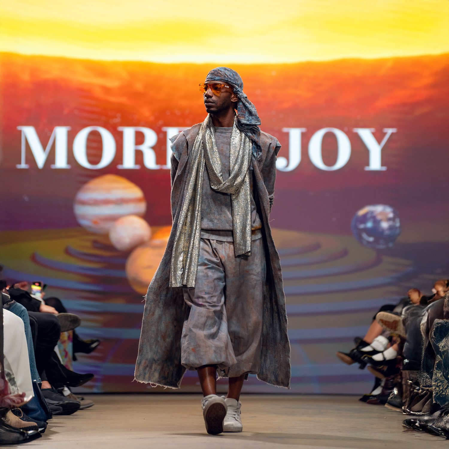
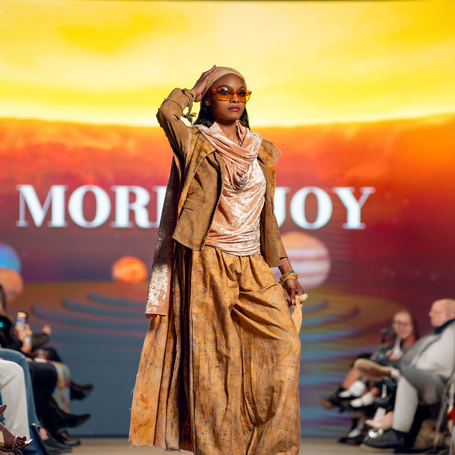
Solid color, head to toe, from my Cosmic Bodies fashion show. Tap a look to see the whole show.
Black
An all-black outfit can look flat or it can look rich. The difference is in the details.
- Mix your blacks. Pair a blue-black with a brown-black or a charcoal, and the outfit gains depth.
- Play with texture. Rayon, denim, knit and leather all reflect light differently, even in the same black.
- Let the dye show. A dash-dyed black with color splits gives you movement without leaving the family.
- Add one point of light near your face: a silver earring, a white collar or a single bright scarf.
These portraits show black styled with intention, on people who made it their own.

On the runway
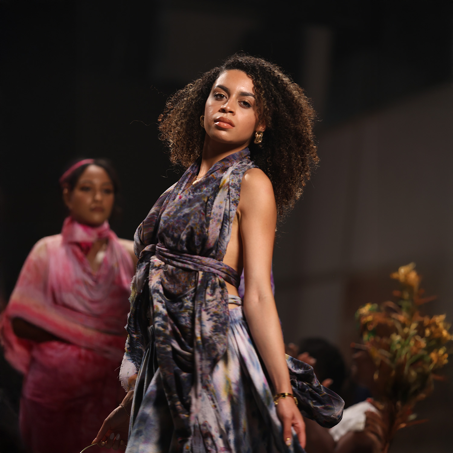
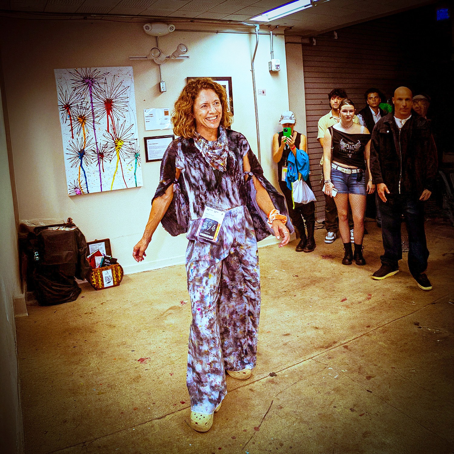
Solid color, head to toe, from my Autumn Rainbow and Vibrant Rainbow fashion shows. Tap a look to see the whole show.
Cool neutrals, dash-dyed
Color tests from my studio: Wild Rags, Festival Scarves, Festival Sarongs and knits dash-dyed in gray. Notice which ones your eye keeps returning to.


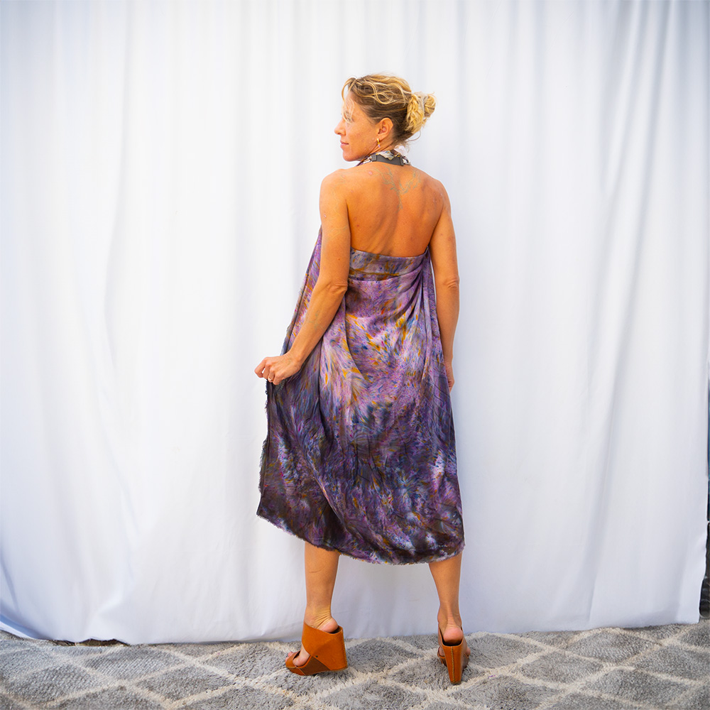
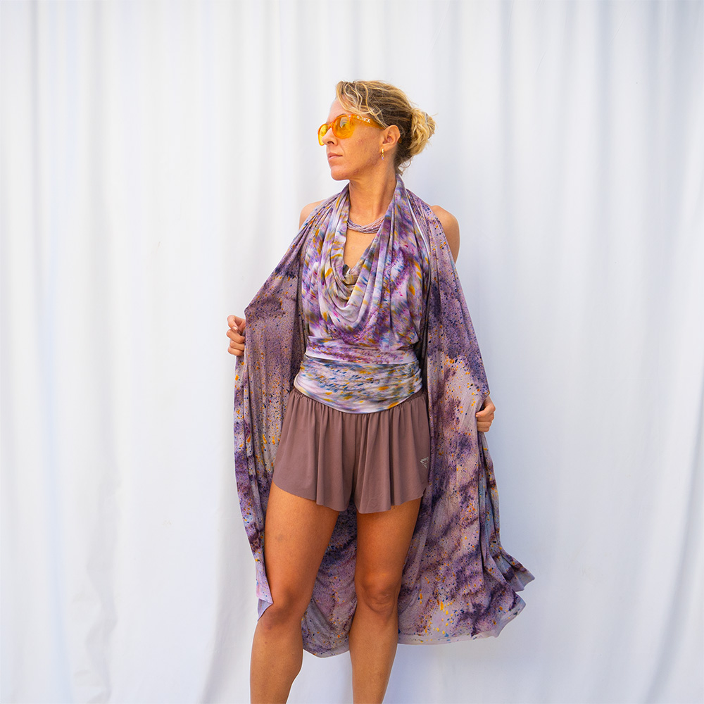


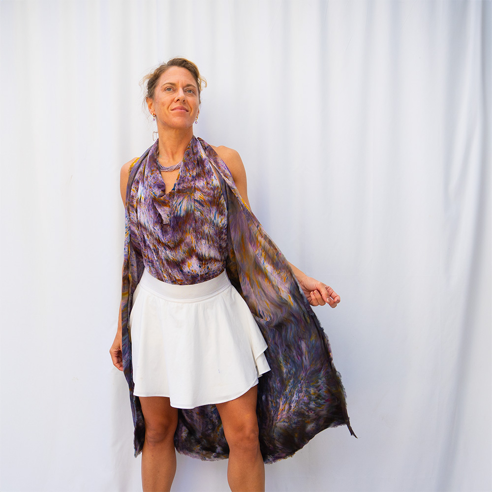

Want to wear these the way I do? Every tie is in Scarf Resources, with how to dye your own scarf.
Black
Color tests from my studio: Wild Rags, Festival Scarves, Festival Sarongs and knits dash-dyed in black. Notice which ones your eye keeps returning to.


Want to wear these the way I do? Every tie is in Scarf Resources, with how to dye your own scarf.
Cool neutrals in a dye session
Neutral dyes are subtle on their own and powerful as a base. A light dash of 045 Ecru or 139 Mist Gray over a white piece softens it into something that looks vintage. Many grays are blends, so their edges can bloom into soft blue or lilac.
Your next step
Book A Color Revival
Three hours to revive your whole closet in the colors that are truly yours: an in-depth color analysis, a closet edit, six pieces dash-dyed as a capsule that mixes and matches, and ten styled photos of you in it.
Color genres come from Personal Color by Anuschka Rees.
More joy is possible.